
10 Typography Layout Ideas for Image Prompt Across Varied Aspect Ratios
Explore 10 typography layout ideas for image prompts across varied aspect ratios including 3:4, 4:5 and 16:9.
Explore 10 typography layout ideas for image prompts across varied aspect ratios including 3:4, 4:5 and 16:9.
Generate a picture is not only about visual but also typography. Headline position and hierarchy change the result as much as style or subject.
The layouts below show what that looks like in practice: 10 typography layouts with the aspect ratio that supports each one and the work they suit.
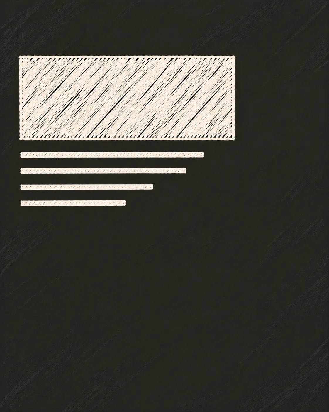
The upper-left naturally establishes a clear reading entry point while leaving space for supporting content.
Recommended aspect ratio: 4:5
Best for: Editorial layouts, articles, news, informative social posts
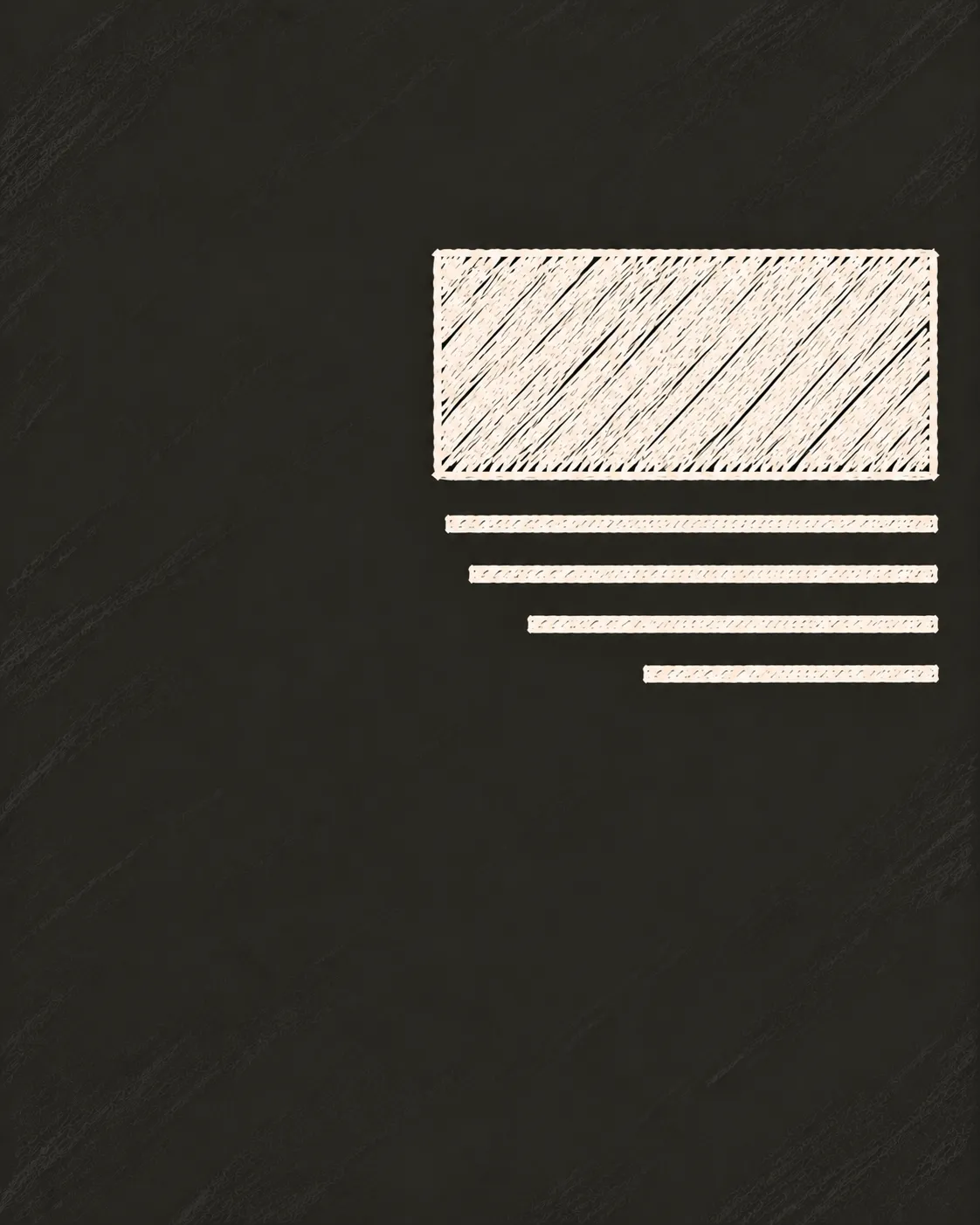
Right-side placement creates an asymmetric, refined composition with generous negative space.
Recommended aspect ratio: 4:5
Best for: Premium layouts, fashion, luxury, minimalist advertising
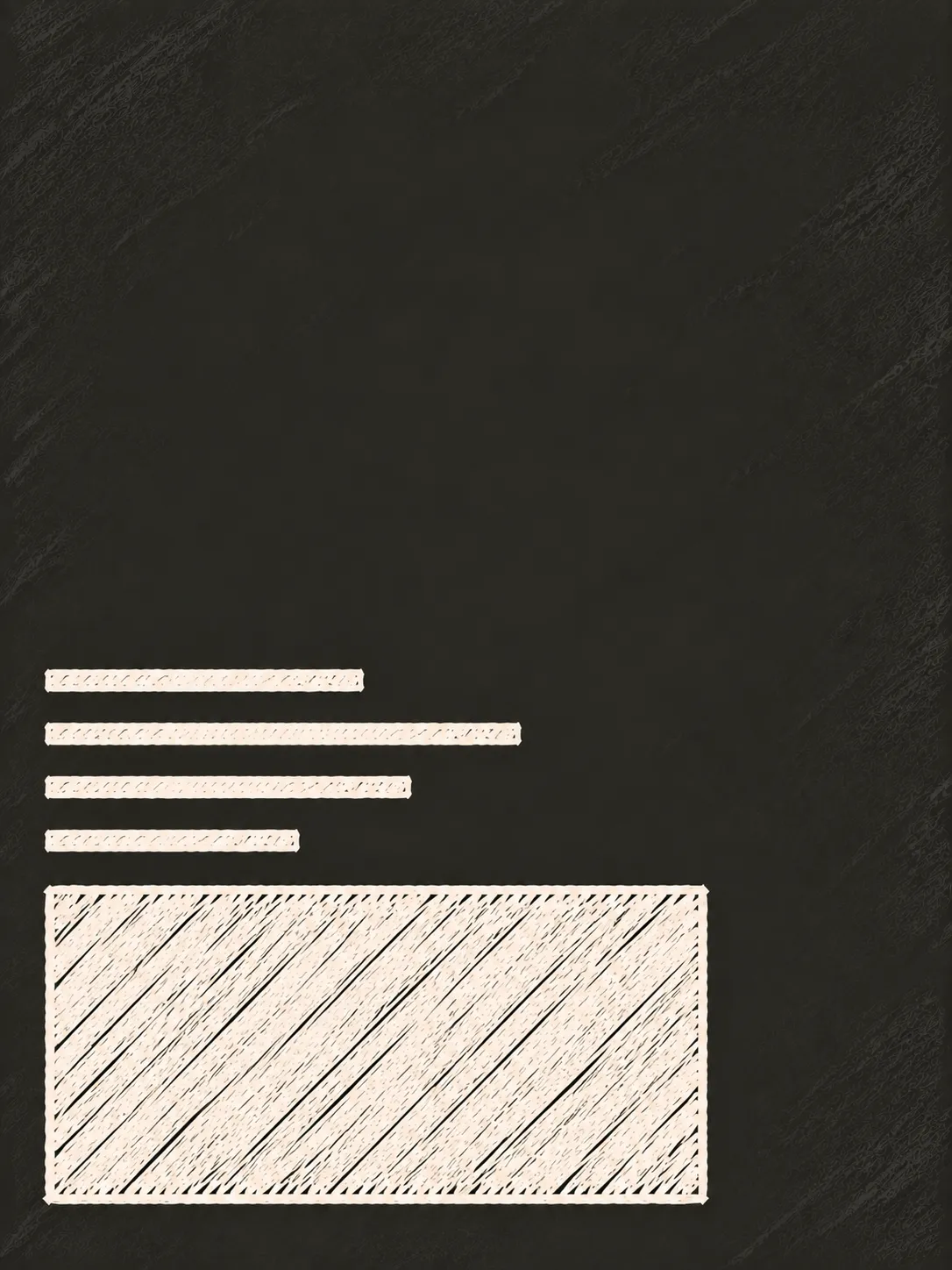
Lower placement lets the visual area dominate while the typography anchors the composition.
Recommended aspect ratio: 3:4
Best for: Photography posters, cinematic designs, storytelling visuals
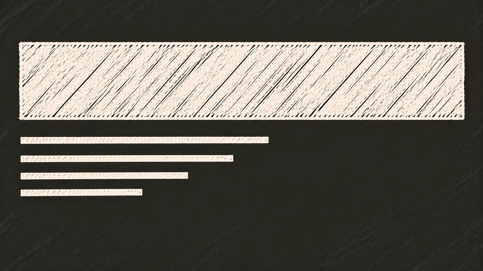
The wide canvas gives a large headline enough horizontal space without feeling cramped.
Recommended aspect ratio: 16:9
Best for: Campaign graphics, announcements, promotional layouts, banners
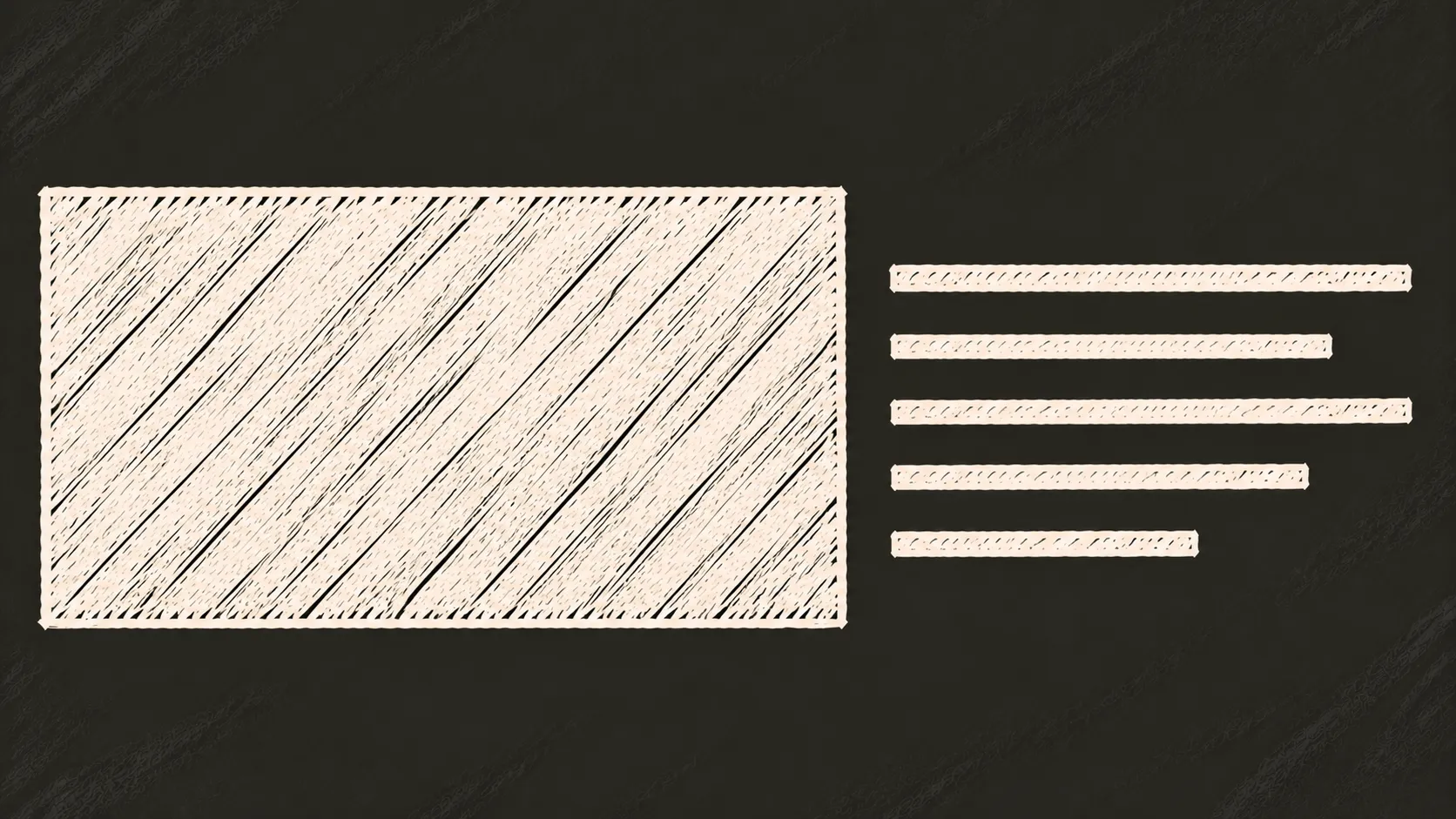
The wide format naturally supports separate left and right information zones.
Recommended aspect ratio: 16:9
Best for: Product presentations, comparison graphics, portfolios, split-screen layouts
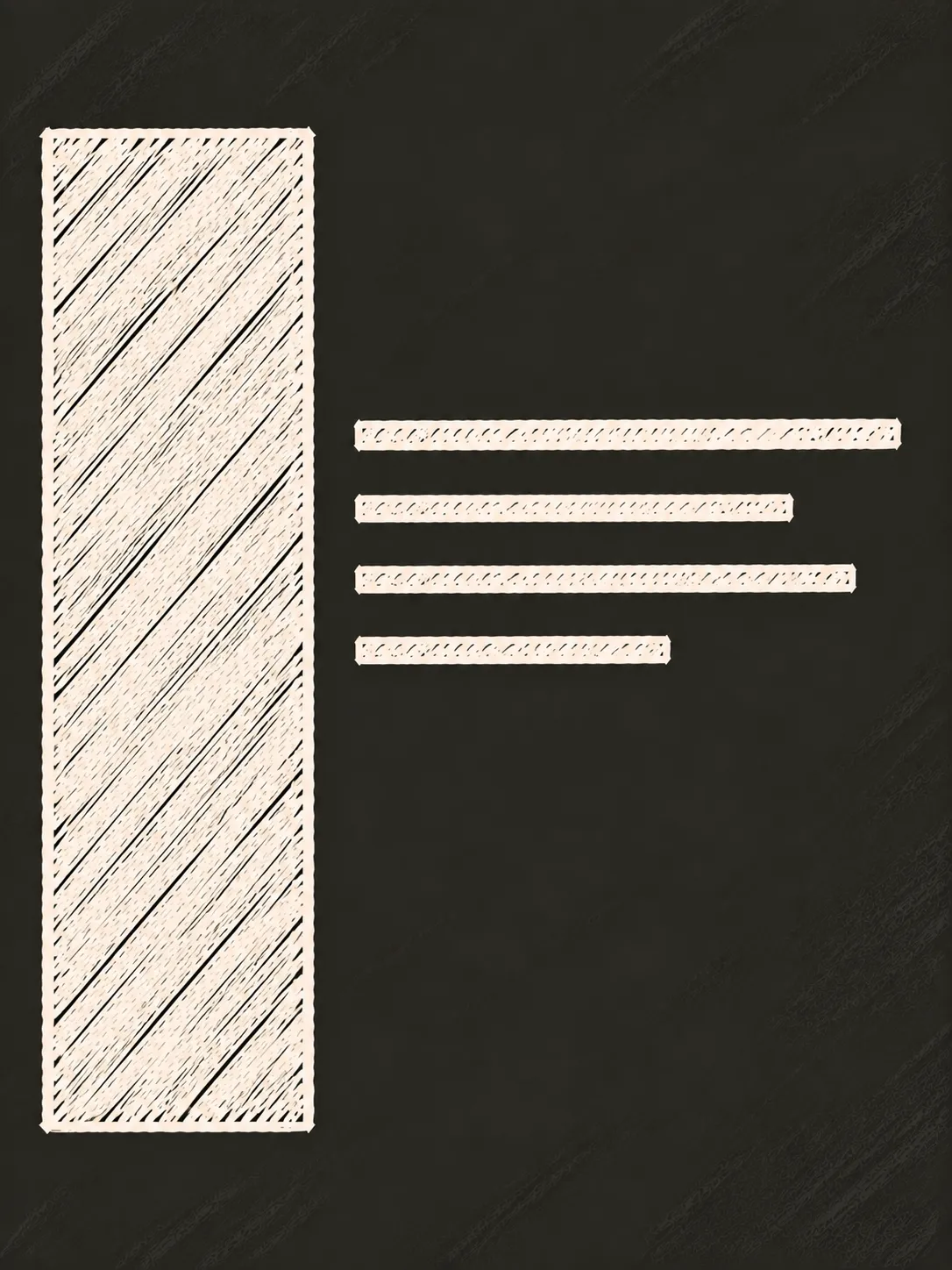
A vertical headline creates a strong directional element and takes advantage of the taller canvas.
Recommended aspect ratio: 3:4
Best for: Fashion editorials, magazine covers, experimental posters
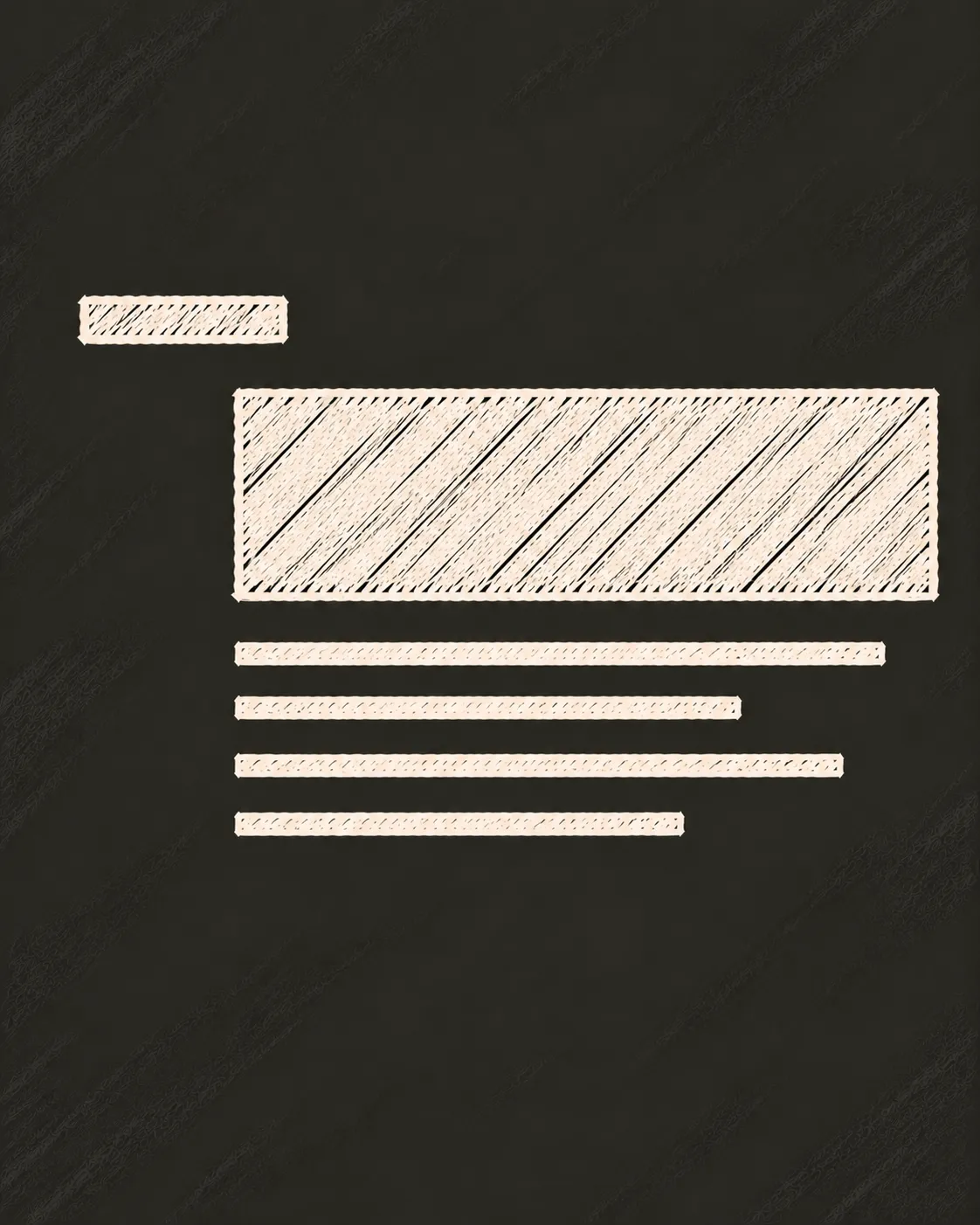
Offset positioning creates visual tension while maintaining a clear hierarchy between label, headline, and brief.
Recommended aspect ratio: 4:5
Best for: Brand campaigns, modern editorials, creative marketing graphics
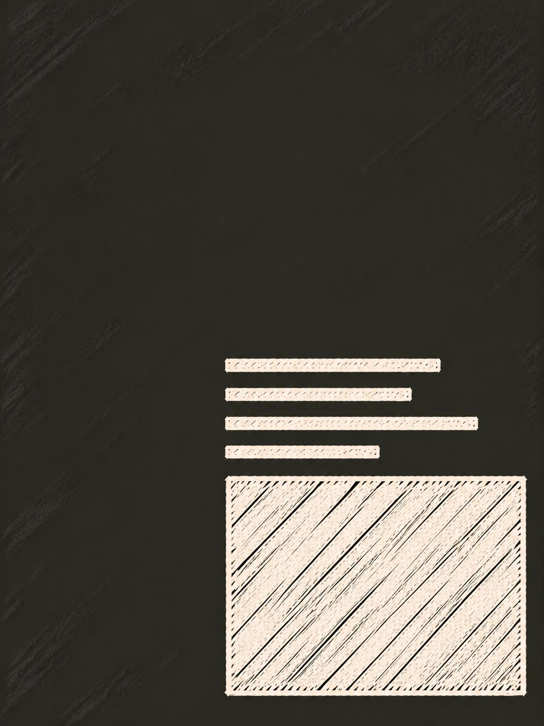
The typography creates a strong visual anchor while preserving the upper area for imagery.
Recommended aspect ratio: 3:4
Best for: Travel posters, lifestyle photography, cinematic visuals
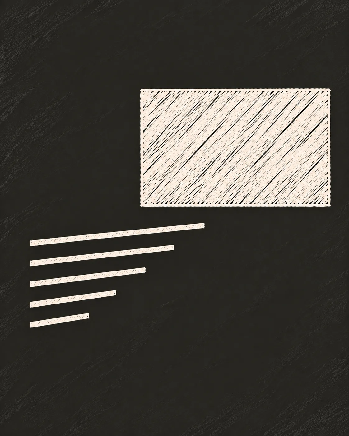
Diagonal positioning between headline and brief creates movement and avoids a static centered composition.
Recommended aspect ratio: 4:5
Best for: Creative advertising, conceptual posters, dynamic social graphics
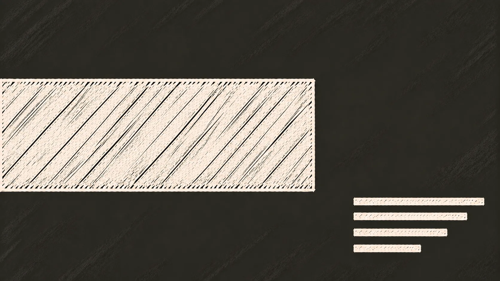
The wide canvas allows typography to extend toward the edges, creating a large-scale graphic feel.
Recommended aspect ratio: 16:9
Best for: Bold posters, campaign visuals, brand statements, web banners