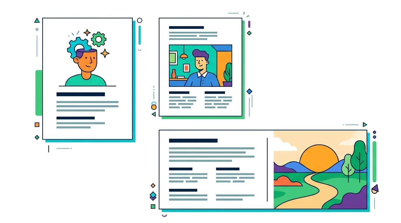
20 Composition Layouts for Posters, Ads and Infographics
20 composition layouts that control focal points, reading paths and hierarchy in posters, ads and infographics.
20 composition layouts that control focal points, reading paths and hierarchy in posters, ads and infographics.
Choosing a composition is the fastest way to decide where the eye lands, how information is scanned and which idea feels most important.
These 20 canvas layouts cover focal points, sequences, comparisons or hierarchy. You can use them as the composition references in your image prompt for posters, ads and infographics.
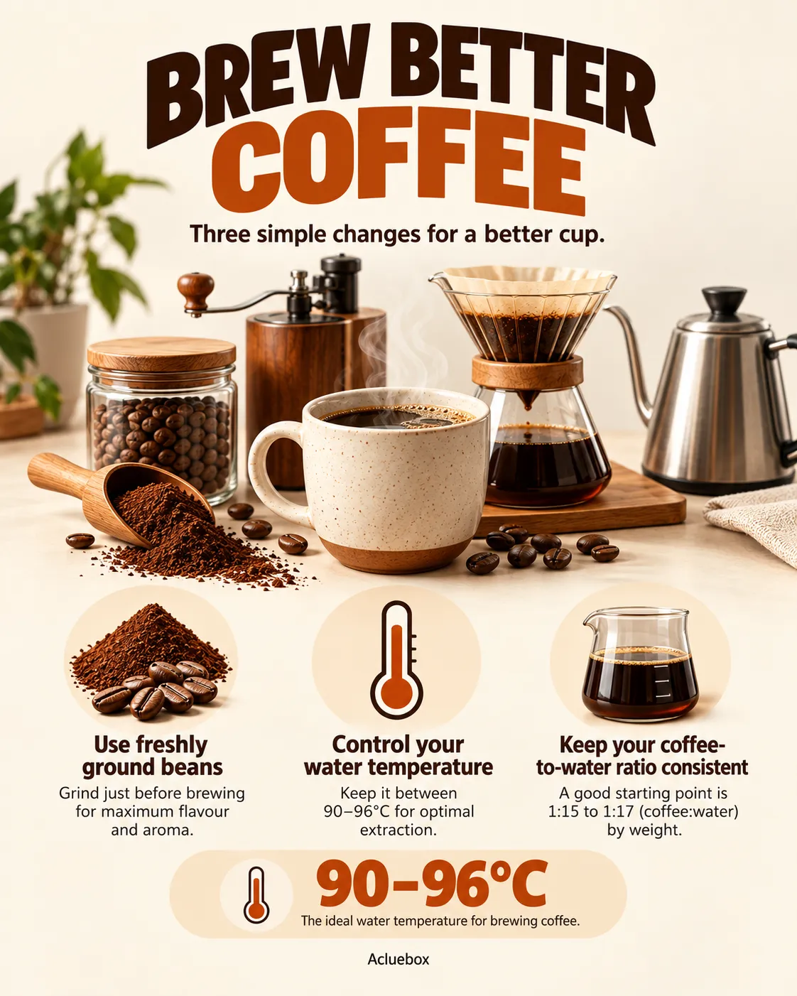
The main subject or content sits in the middle of the canvas, with space or secondary marks radiating outward from that point.
Why use it: Creates a strong focal point and clear visual hierarchy.
Best for: Posters, announcements, title cards
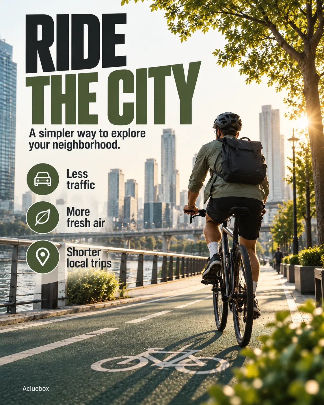
Main elements sit along the lines that divide the canvas into thirds, both horizontally and vertically, instead of locking everything to the center.
Why use it: Creates a natural, balanced composition without feeling rigid.
Best for: Photography, editorial, lifestyle visuals
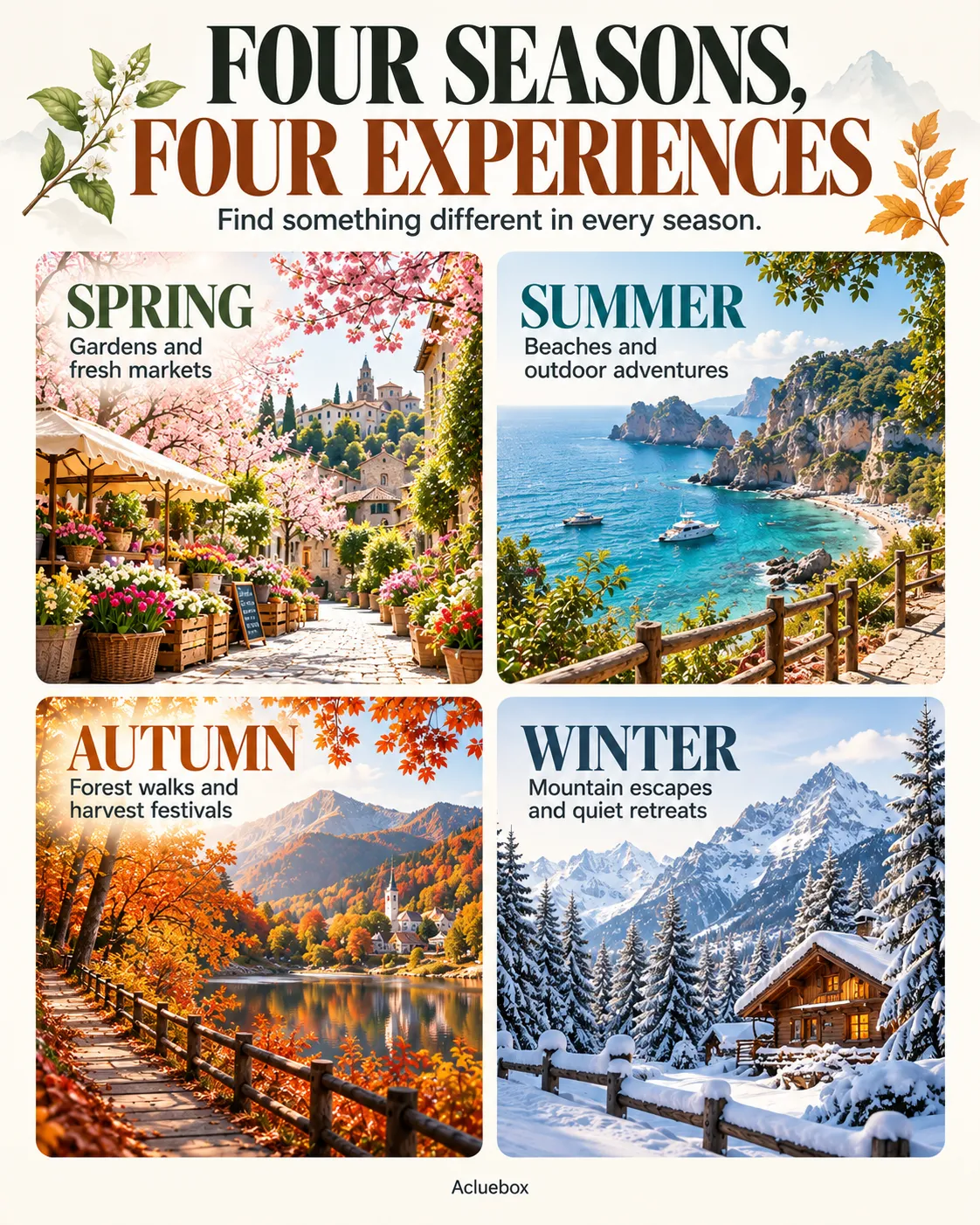
Four equal sections are arranged in two columns and two rows, each holding one idea at the same visual weight.
Why use it: Separates multiple ideas into equally weighted sections.
Best for: Comparisons, steps, product features
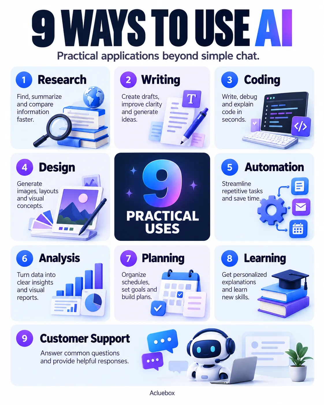
Nine evenly sized cells are arranged in three columns and three rows, giving each item a consistent slot.
Why use it: Allows more information while maintaining consistent structure.
Best for: Infographics, collections, visual guides
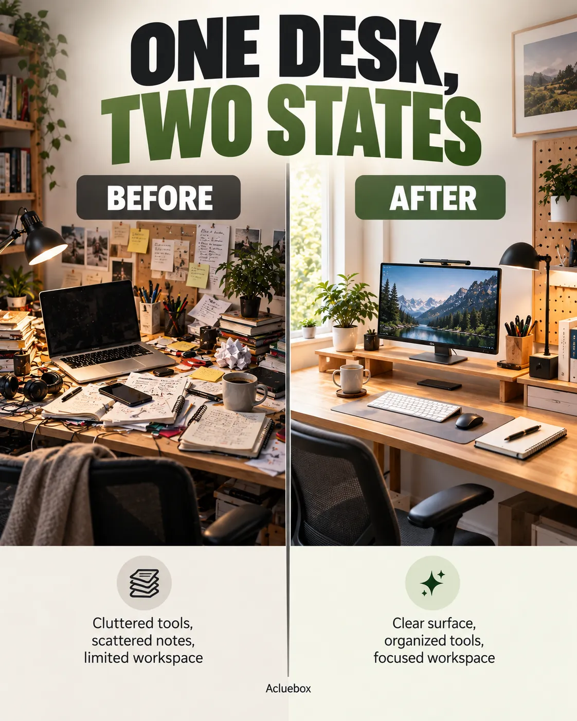
The canvas is divided into two distinct areas, usually left and right or top and bottom, so each side can carry its own subject.
Why use it: Makes differences between two subjects immediately clear.
Best for: Before/after, comparisons, A vs B
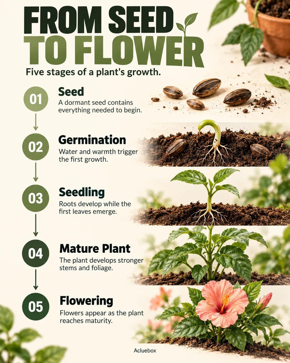
Information is stacked from top to bottom in a defined order, with spacing that marks each step or block.
Why use it: Creates a natural top-to-bottom reading sequence.
Best for: Step-by-step infographics, timelines
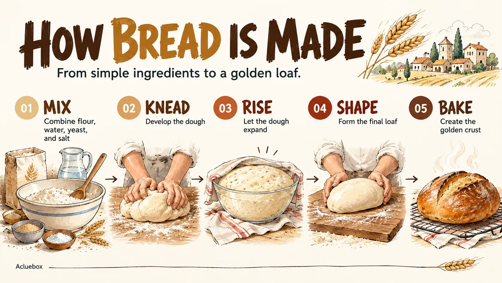
Information runs sequentially from left to right across the canvas, often as a chain of stages or stops.
Why use it: Encourages left-to-right visual progression.
Best for: Processes, journeys, timelines
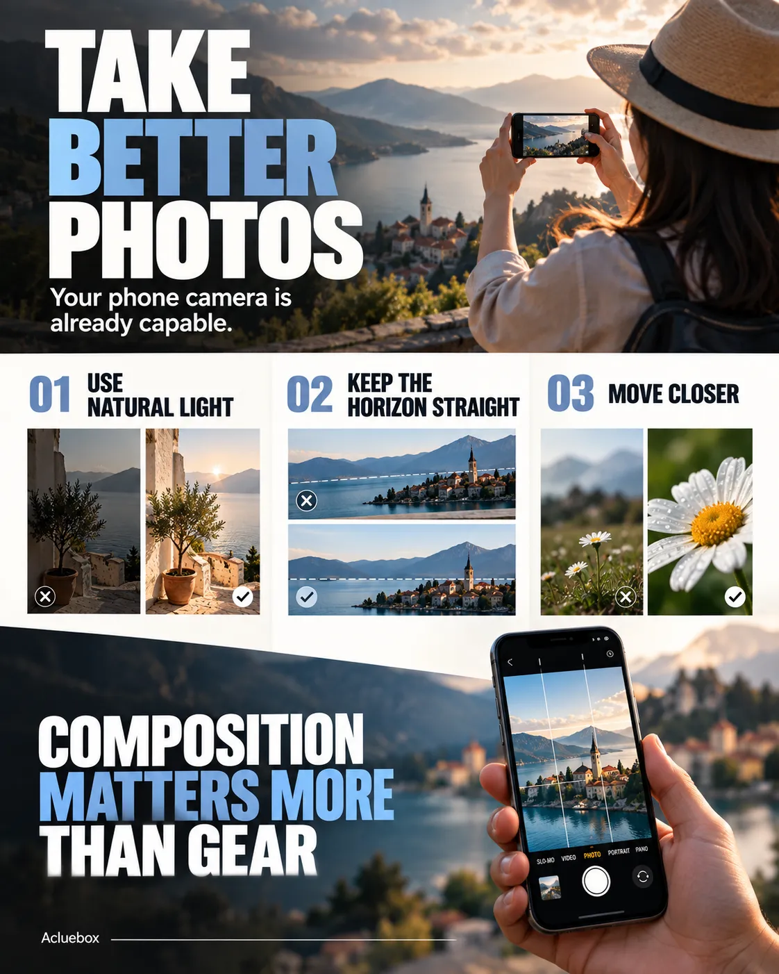
Content follows a Z-shaped path: top left to top right, then diagonally down, then across the bottom.
Why use it: Guides attention through key points in a predictable reading path.
Best for: Landing-page graphics, promotional posters
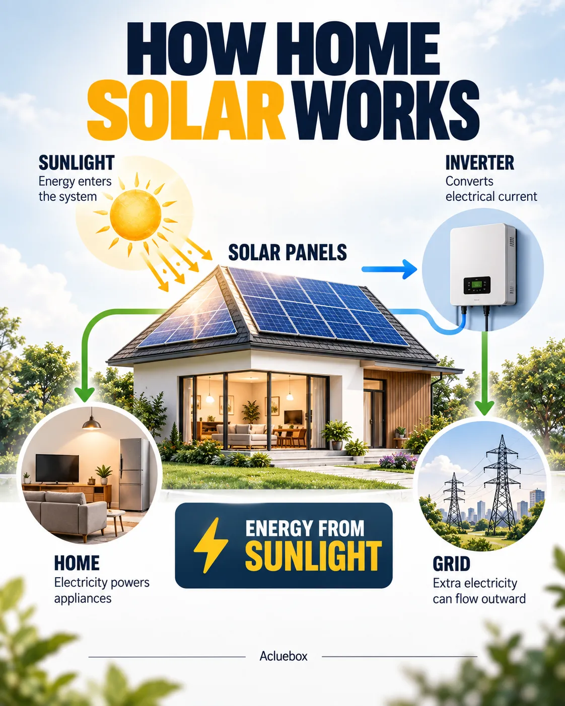
The main subject occupies the center, and supporting labels, icons, or facts sit around it in a controlled ring or cluster.
Why use it: Establishes one dominant focal point while keeping secondary information organized.
Best for: Product advertisements, educational graphics
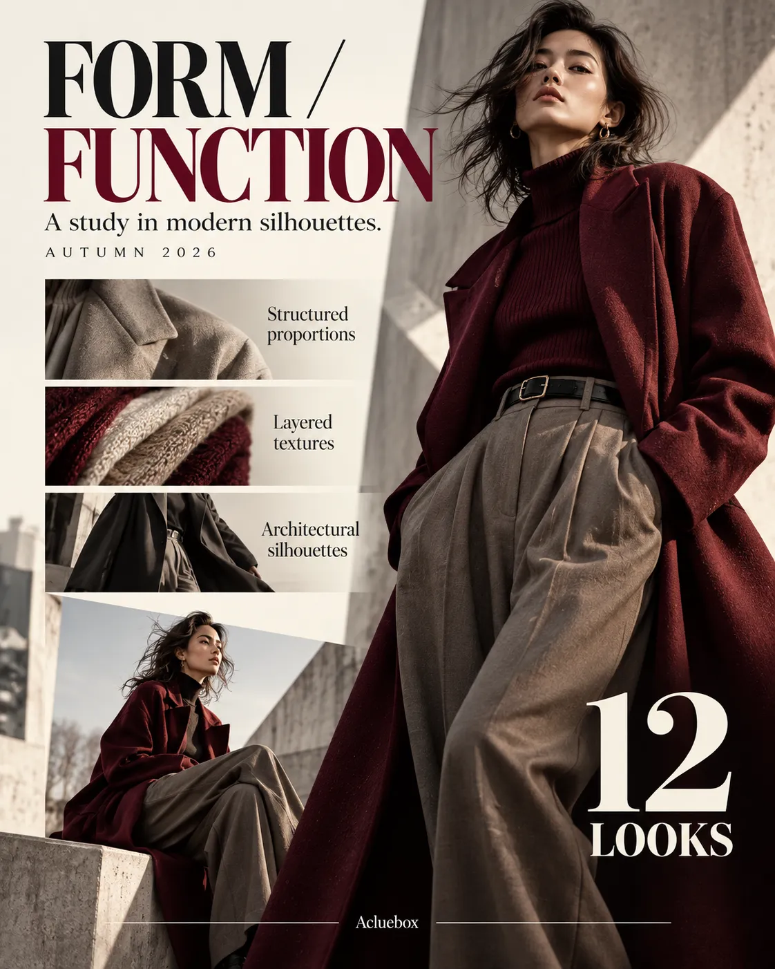
Unequal elements are balanced through size, spacing, and visual weight rather than mirror symmetry.
Why use it: Creates a more dynamic and editorial appearance.
Best for: Magazine layouts, fashion posters, editorial infographics
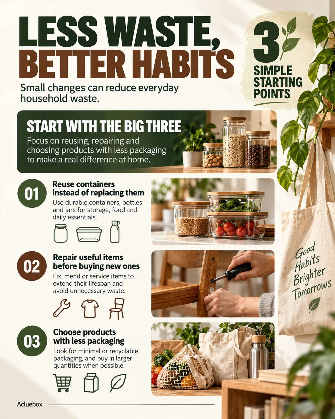
Information is concentrated toward the upper and left areas, matching how people scan text-heavy pages.
Why use it: Matches natural scanning behavior for text-heavy layouts.
Best for: Articles, text-heavy infographics, guides

Elements progress on a diagonal across the canvas, so the reading path feels directional rather than flat.
Why use it: Adds movement and visual energy.
Best for: Dynamic posters, sports, campaigns
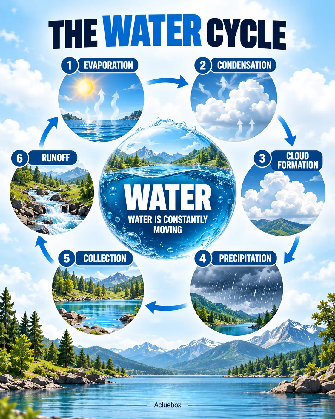
Elements follow a circular path around a central point, so the sequence can loop back to the start.
Why use it: Creates a continuous visual journey.
Best for: Cycles, processes, ecosystems
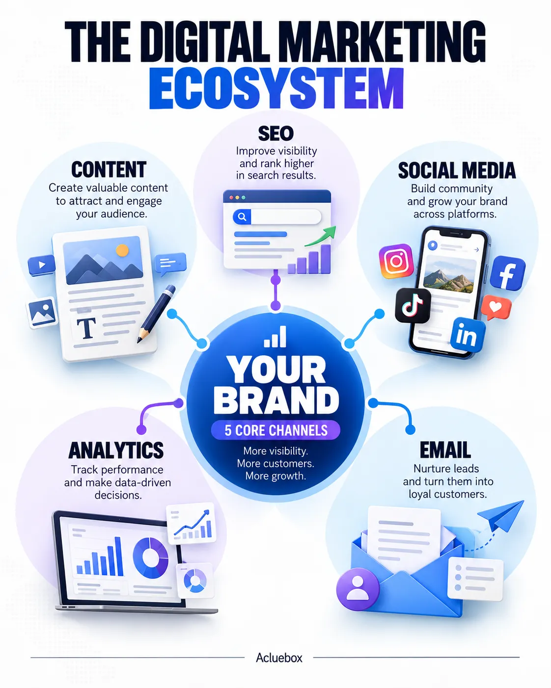
Supporting elements radiate outward from the center, with the core idea at the middle of the system.
Why use it: Makes one concept the clear center of attention.
Best for: Mind maps, concept diagrams, systems
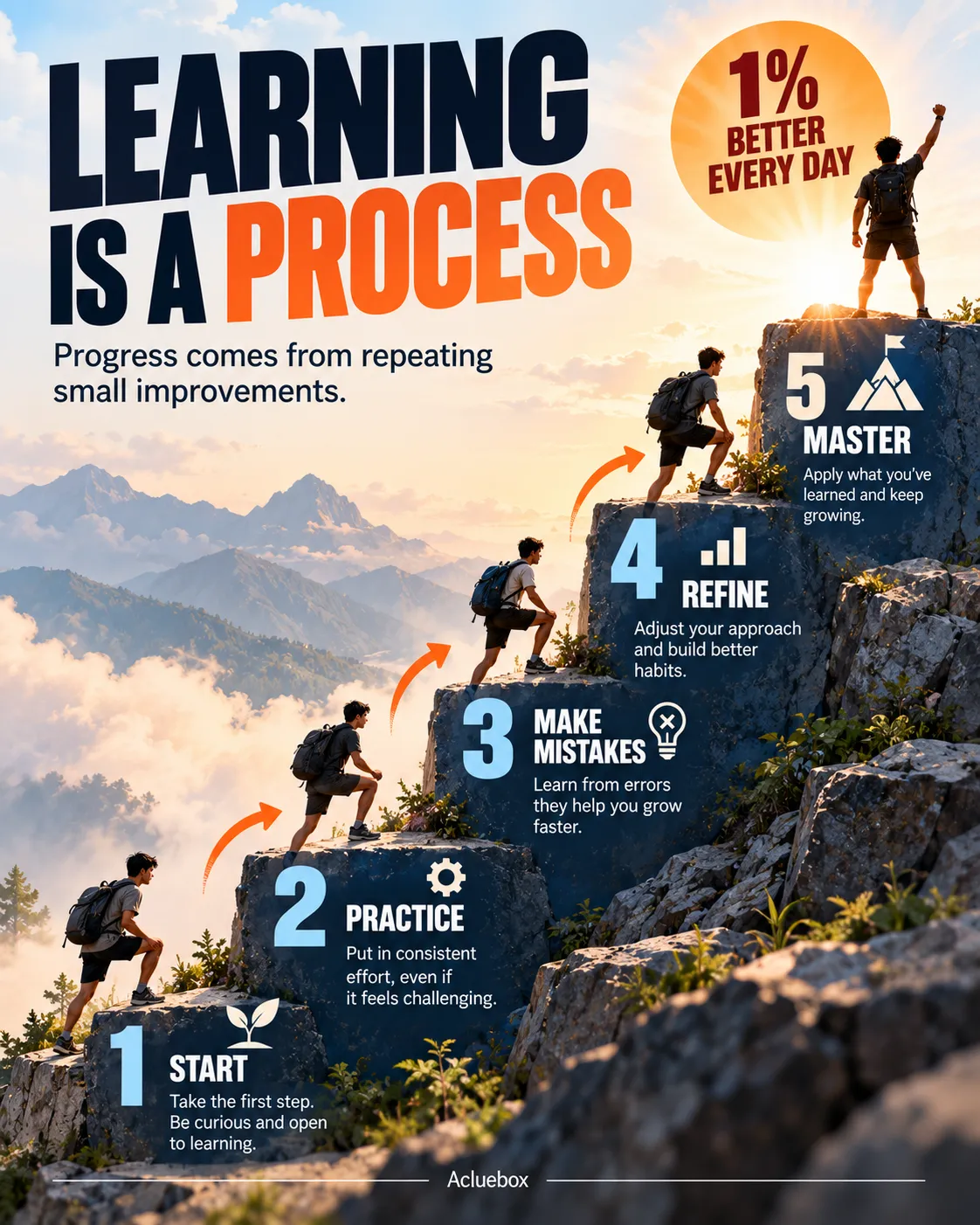
Content rises or falls in sequential steps, each block offset so the progression is visible at a glance.
Why use it: Creates a strong sense of progression.
Best for: Tutorials, growth stages, processes
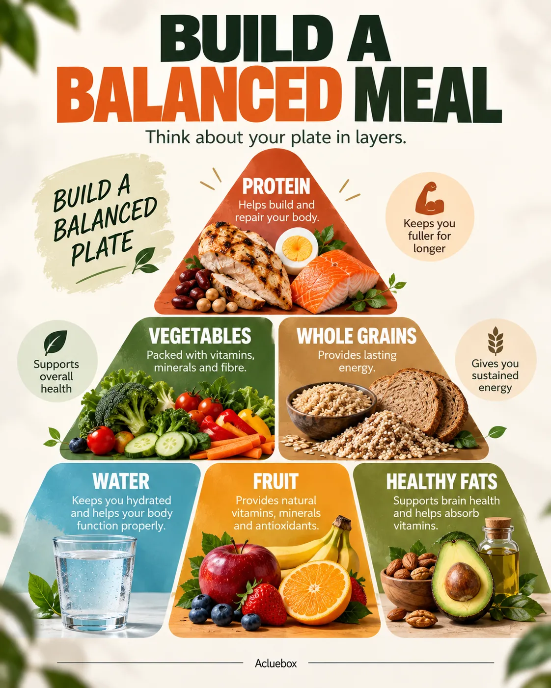
Information is arranged from broad to narrow, with the widest level at the base and the most specific idea at the top, or the reverse when the peak should lead.
Why use it: Establishes clear levels of importance.
Best for: Hierarchies, frameworks, organizational charts
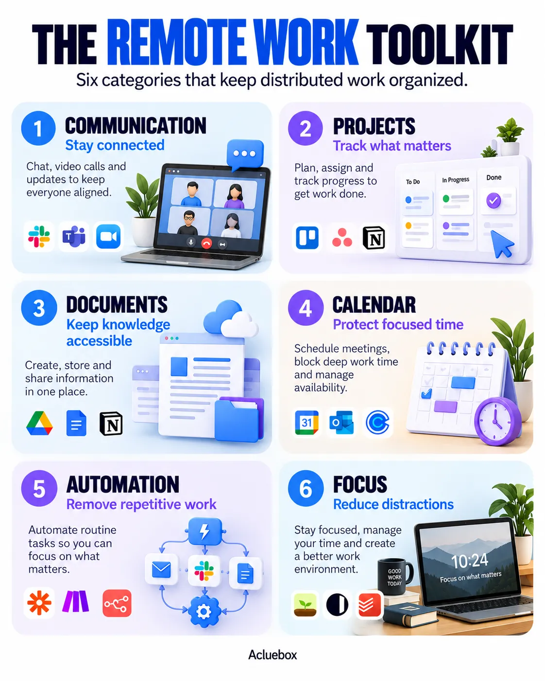
Content is contained in visually distinct blocks, each card acting as its own module with a title, fact, or feature.
Why use it: Separates information into independent modules.
Best for: Feature lists, dashboards, product comparisons
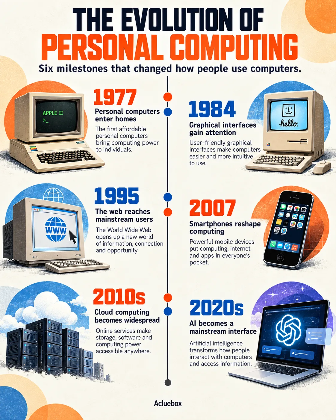
Events follow a defined chronological axis, with dates or stages placed along a line so order is immediate.
Why use it: Makes chronological relationships immediately clear.
Best for: History, roadmaps, milestones

A large hero element dominates the canvas, and smaller information blocks sit beside or beneath it.
Why use it: Gives one element dominant visual importance.
Best for: Product posters, travel visuals, advertisements
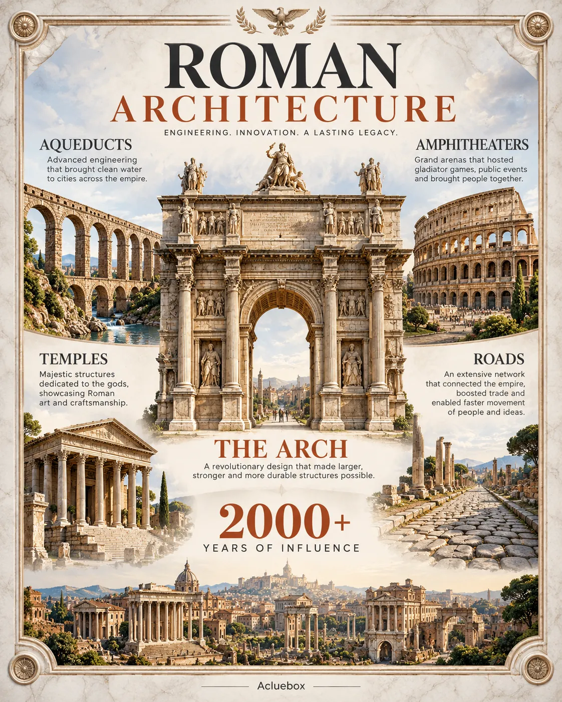
Secondary elements create a visual frame around the main content, directing attention into a defined central area.
Why use it: Focuses attention toward a defined central area.
Best for: Editorial posters, photography, premium designs