Pick an Ad Layout Before You Write the Line
10 ad structures, from problem and fix to before and after, scarcity, and story, with a reason to use each one.
10 ad structures, from problem and fix to before and after, scarcity, and story, with a reason to use each one.
The line is not the first decision. The layout is.
These 10 setups each do one job: announce, agitate, count, ask, compare, list, quote, rush, narrate, or offer.
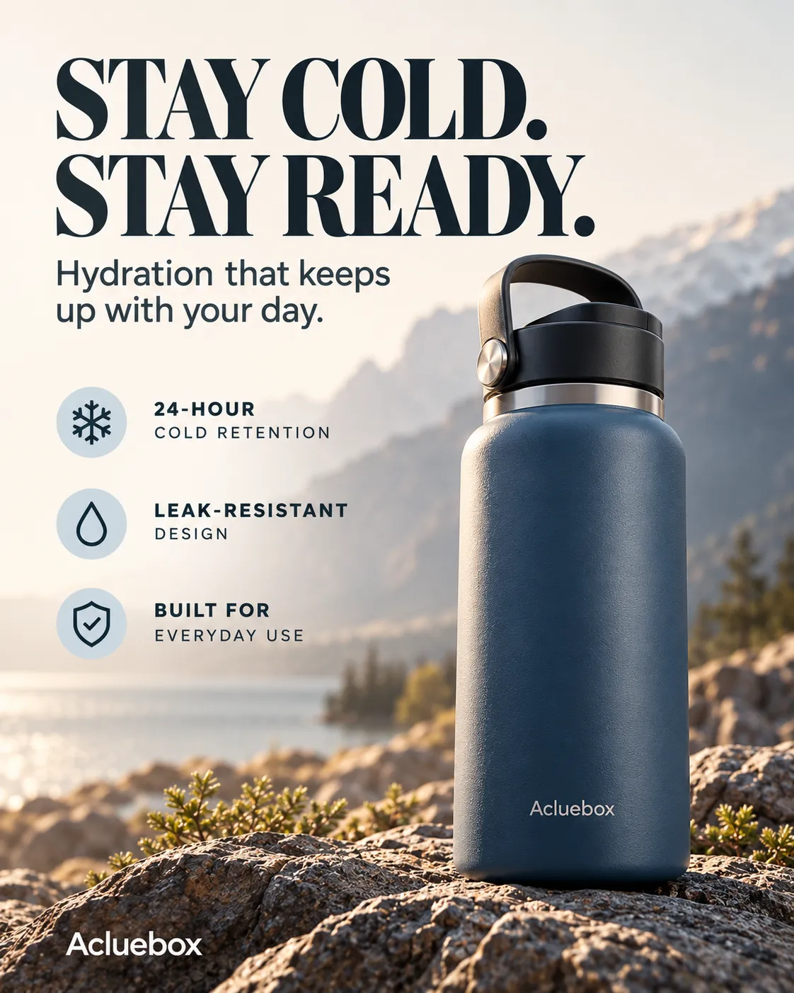
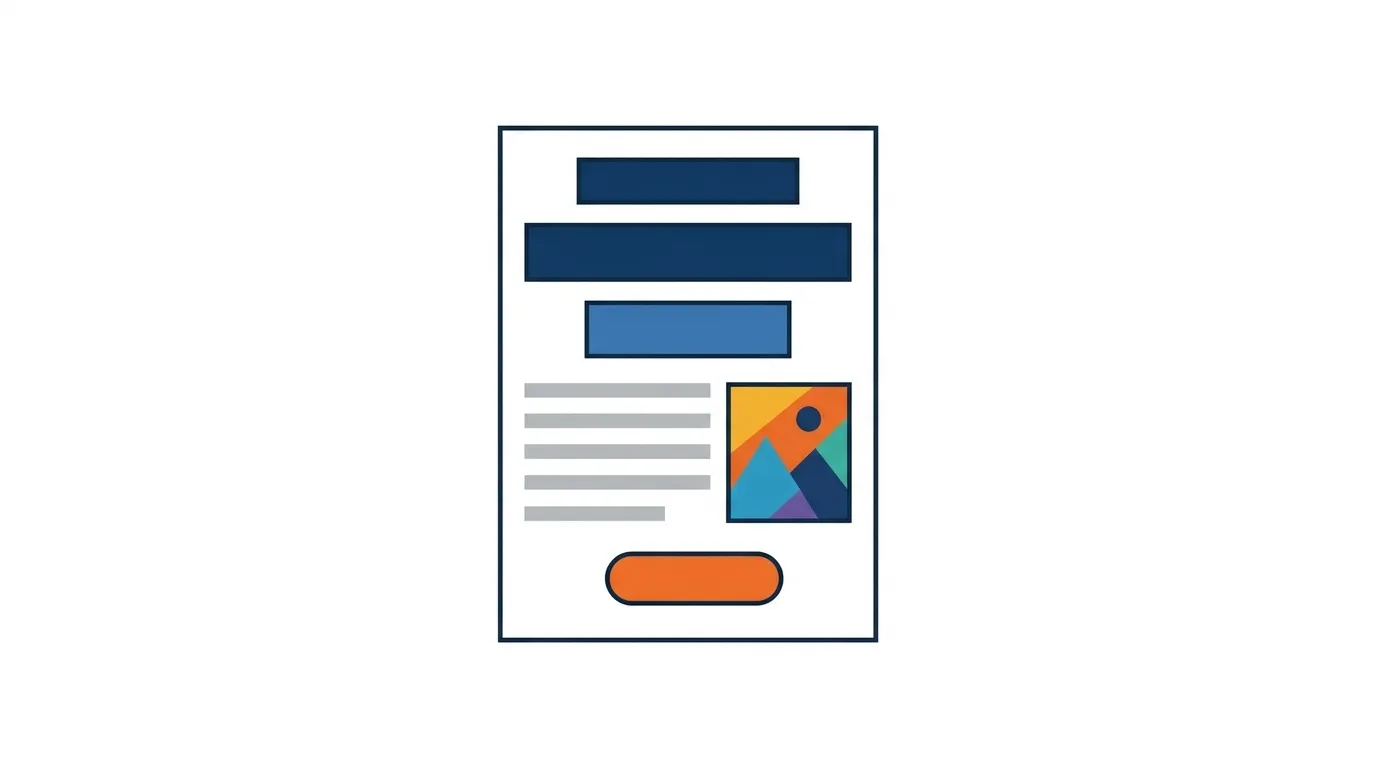
Lead with one strong headline, then the product, then a few supporting benefits under it. The title carries the ad. The lines below only back it up.
Why use it: It is simple and clear, and it puts the main message in front of the reader before anything else.
Best for: Product launches, brand awareness, premium products, lifestyle products.
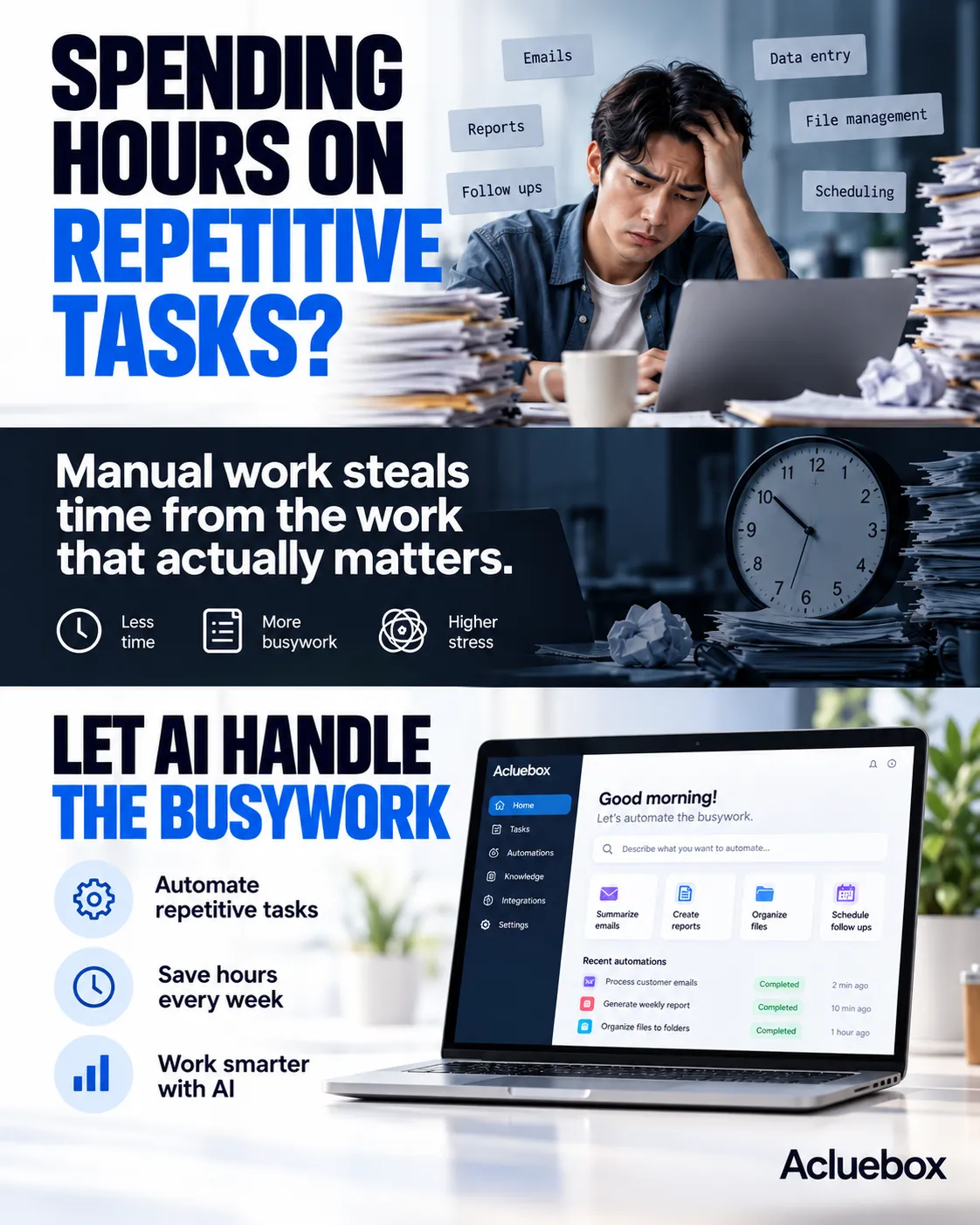
Open with the customer's problem, press on the frustration, then place the product as the fix. Pain sits first. The offer arrives only after the cost of staying stuck is clear.
Why use it: It creates emotional relevance and makes the product feel necessary instead of optional.
Best for: SaaS, AI tools, productivity apps, business services.
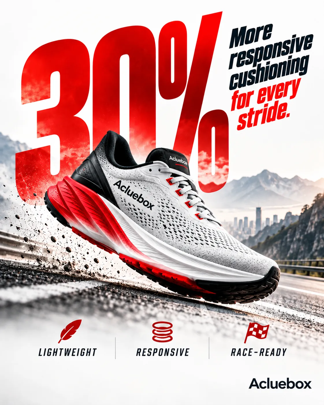
Make a large statistic, percentage, price, or performance figure the main visual element. A short proof line and two supports sit under it. The figure does the stopping.
Why use it: Numbers grab attention quickly and communicate value at a glance, before the brand name has to.
Best for: Fitness products, technology, finance, performance products, statistics-driven ads.
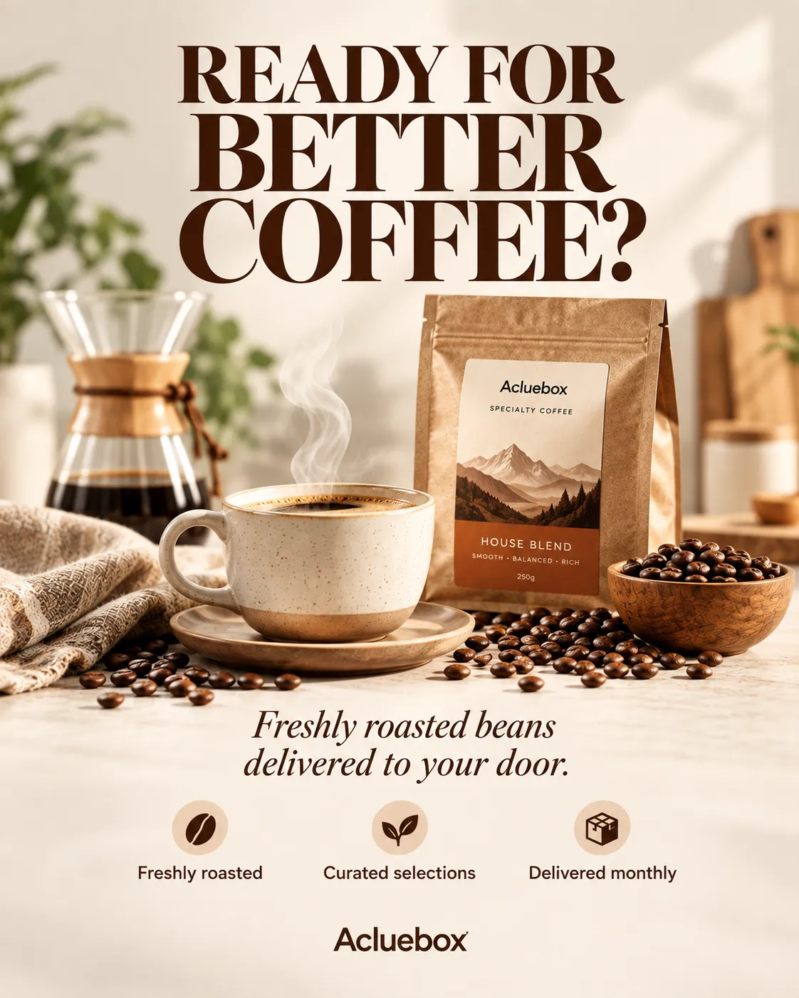
Open with a question that hits a desire, a problem, or a point of curiosity. A short answer follows, then the offer line. The reader replies in their head before they are sold.
Why use it: It encourages viewers to mentally answer the question and keep reading instead of skipping the frame.
Best for: Lifestyle products, food, beauty, subscriptions, consumer products.
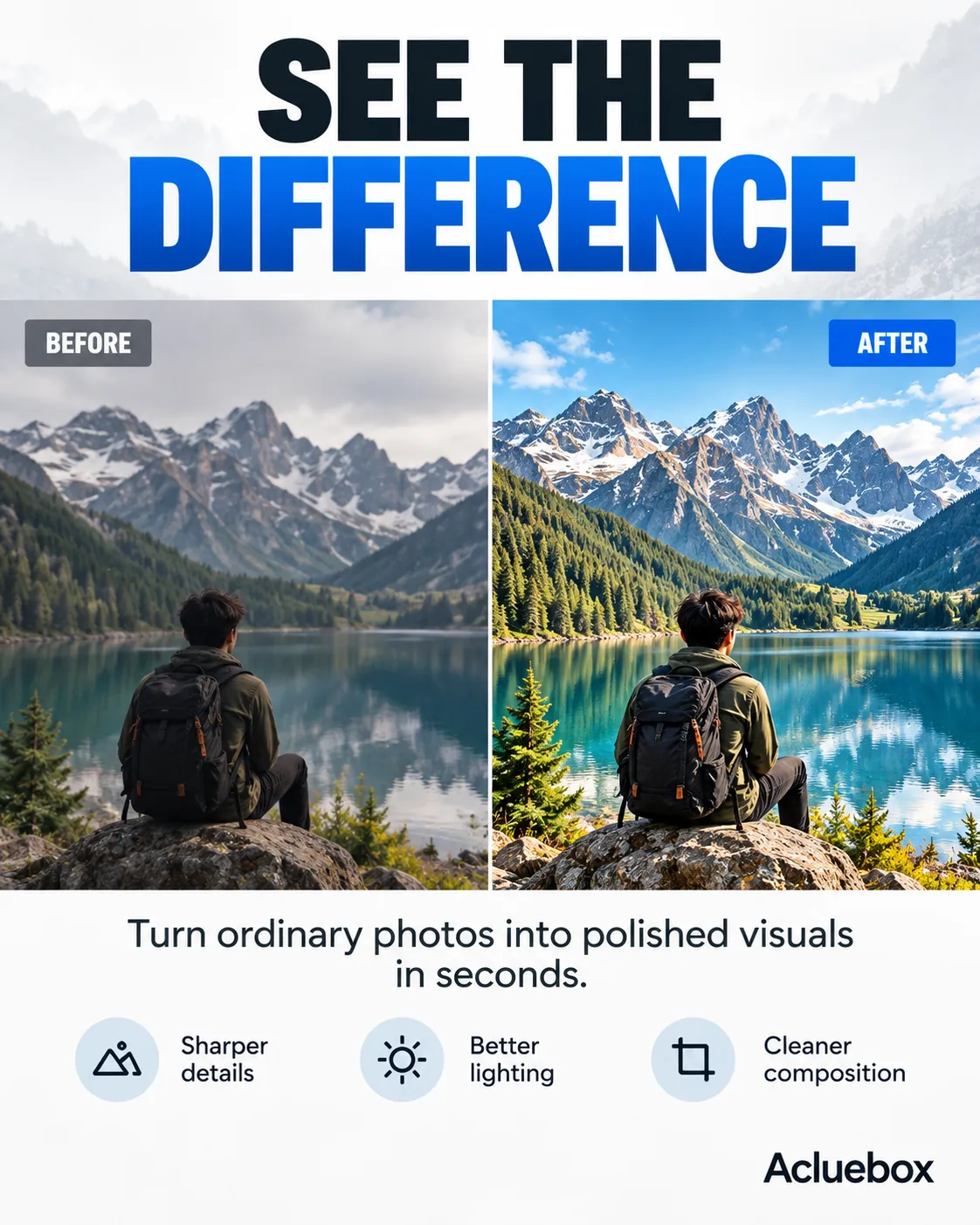
Show the starting state and the improved result side by side, with one bridge line between them. The change is the layout, not a paragraph about the change.
Why use it: It makes the product's transformation immediately visible, so the reader does not have to imagine the difference.
Best for: Photo editing, beauty, cleaning, fitness, design tools, home improvement.
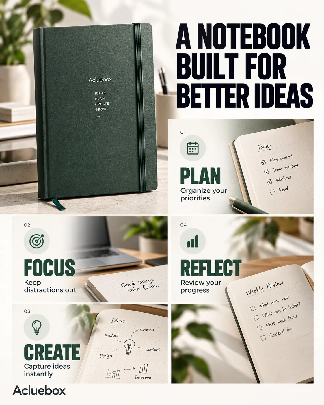
Present several product benefits as a short stack of easy-to-scan lines, with the price at the bottom. Each line is one reason. The eye can skip.
Why use it: It communicates multiple reasons to choose the product without relying on a long explanation.
Best for: SaaS, productivity tools, consumer products, apps, services.
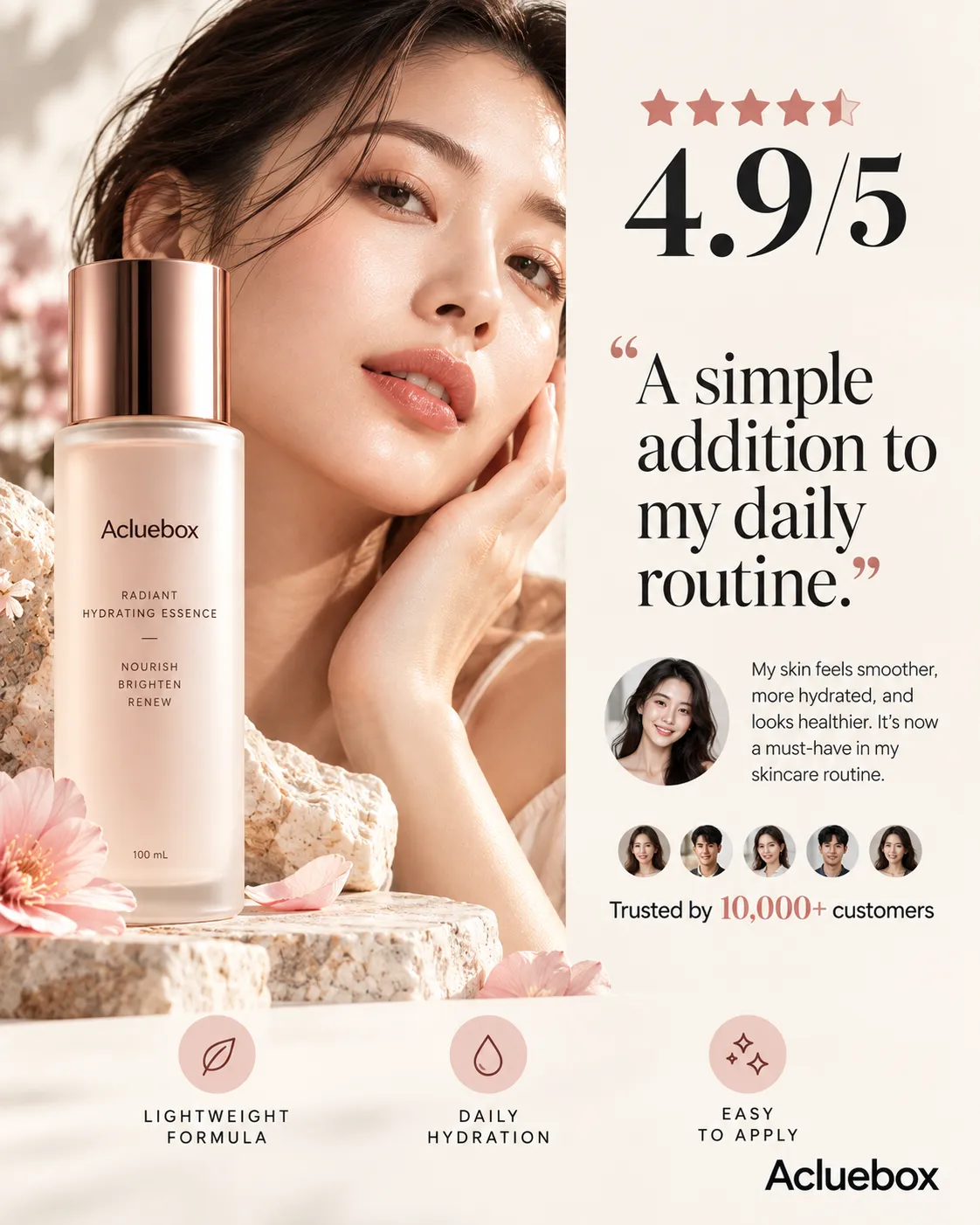
Pair the product with a quote, a name, a rating, a customer count, or another trust signal. The other person's words hold the center. The brand stays small.
Why use it: It reduces uncertainty and makes the product appear credible and already trusted by someone else.
Best for: Beauty, e-commerce, SaaS, services, restaurants, subscription products.
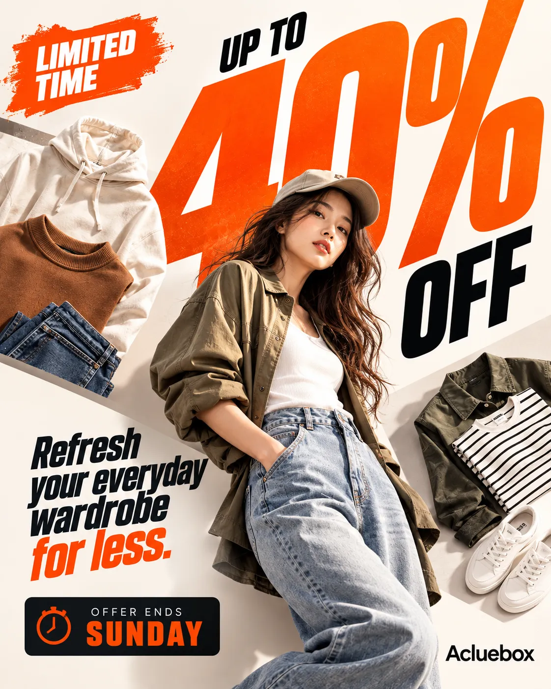
Highlight a limited-time offer, a deadline, a countdown, or limited availability. A corner badge and one time line do the work. The date is the point.
Why use it: It creates a reason to pay attention and act before the opportunity disappears.
Best for: Sales campaigns, promotions, seasonal products, fashion, e-commerce.
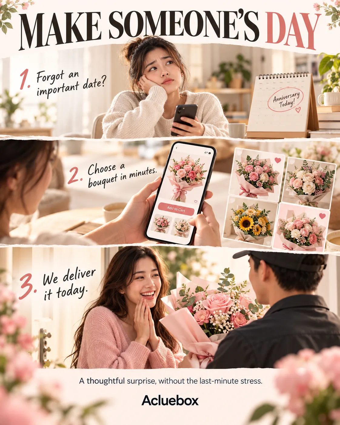
Present the customer's path as a short sequence: situation, then action, then outcome. Three beats, top to bottom. No feature dump.
Why use it: It makes the advertisement more relatable and memorable than a purely promotional layout.
Best for: Delivery services, travel, lifestyle brands, apps, customer experiences.
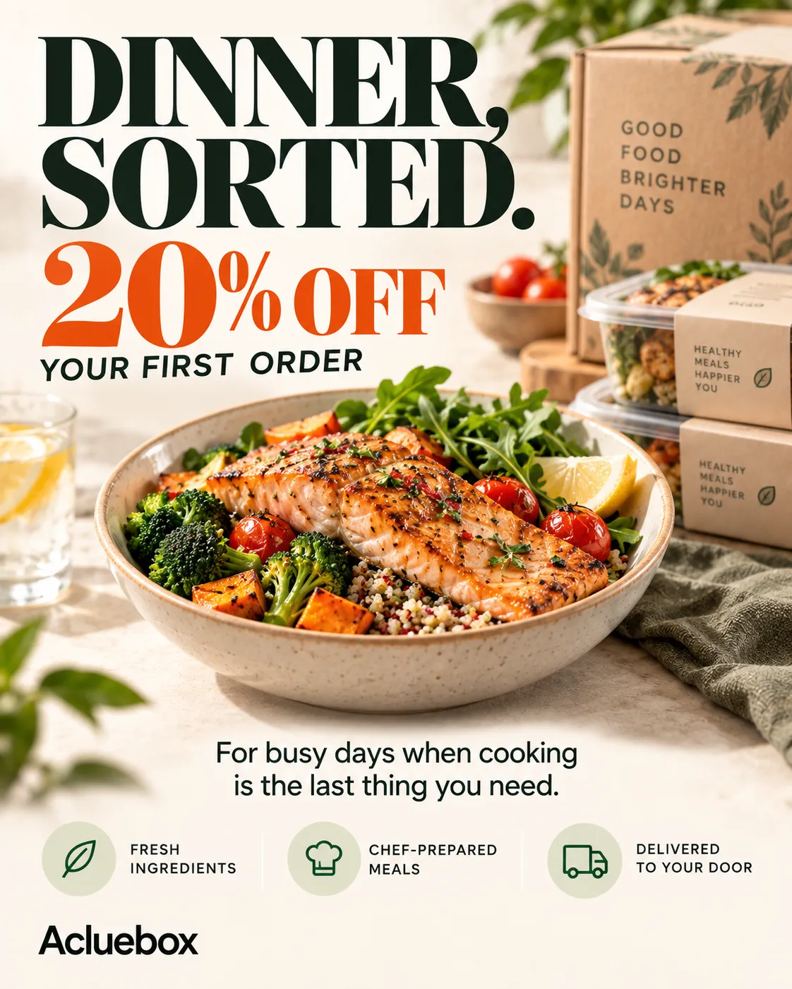
Put the product, the offer, and the core value in the center of the frame. Terms sit where they can be read in one pass. There is no warmup.
Why use it: It delivers the commercial message quickly, with minimal distraction from the deal itself.
Best for: Discounts, product promotions, e-commerce, food delivery, subscriptions.
Match the goal to the layout, then write the line to fit that order.
If you need one strong message up front, then use Classic Headline. A title leads, the product follows, and a few benefits sit underneath.
If you need people to feel a problem, then use Problem → Agitate → Solve. Pain opens, frustration follows, and the product arrives as the fix.
If you need an impressive metric to stop the scroll, then use Big Number Lead. One figure dominates, and a short proof line explains it.
If you need to spark curiosity, then use Question Hook. A question opens, a short answer follows, and the offer line comes last.
If you need to show a transformation, then use Before / After. The old state sits on one side, the later state on the other, with one bridge line between them.
If you need to explain several benefits, then use Benefit Stack. Short lines stack down the frame, and the price sits at the bottom.
If you need to build trust, then use Social Proof. A quote holds the center, a name sits under it, and a count or rating backs it up.
If you need time-sensitive action, then use Urgency. A corner badge and one deadline line make the offer feel current.
If you need a relatable path, then use Mini Story. Situation, action, and outcome run top to bottom.
If you need to sell a specific deal, then use Direct Offer. Product, terms, and who it is for sit in one pass, with no warmup.