Type Setups for Long-Copy Pieces
Piece jobs and the 1 to 3 face setups that keep schedules, prices and fine print readable.
Piece jobs and the 1 to 3 face setups that keep schedules, prices and fine print readable.
A piece with a schedule, a price and a terms line is not a headline exercise. The face has to match the job of each line.
These 14 setups stay at 1 to 3 faces. Extra lines reuse a face and change size or weight.
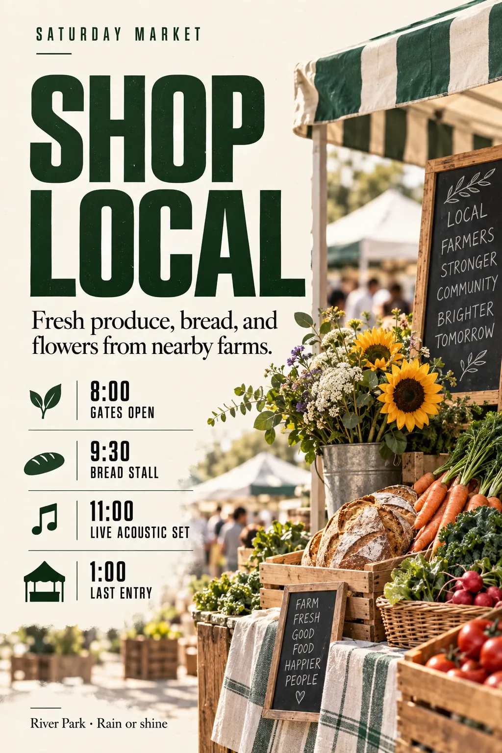
A Saturday market poster needs a kicker, a short headline, one intro line, a timed schedule, and a place footer. Most of the panel is times and stall names, so the type has to stay narrow and even.
Why use it: Condensed sans carries the schedule without wrapping each row, while serif is reserved for the intro and the footer so the list stays one voice.
Best for: Event listings, food markets, and any poster that is mostly times.
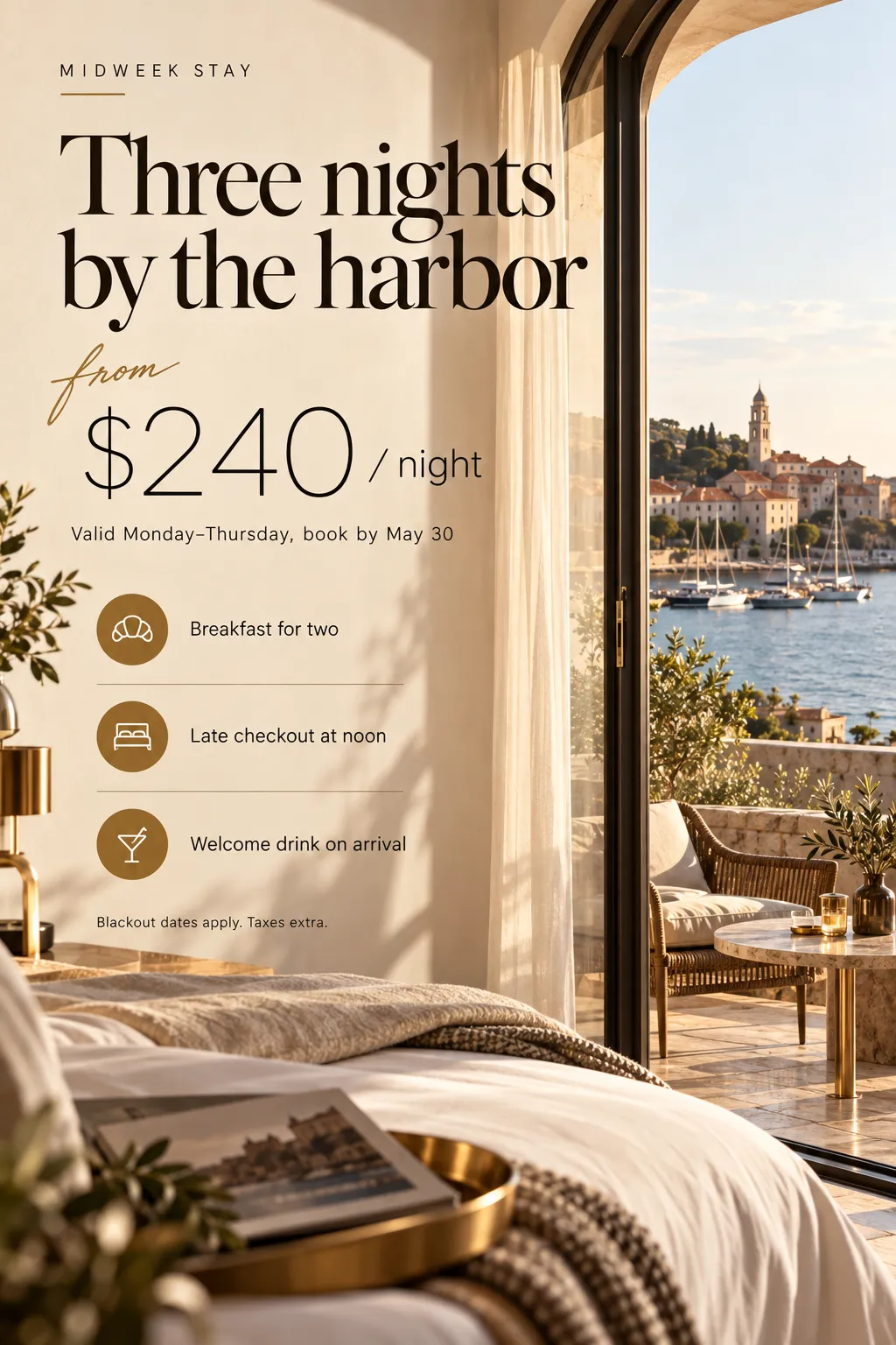
A midweek rate card pairs a stay name with a script "from", a large price, dates, three inclusions, and a terms line. The offer has to feel considered without burying the number.
Why use it: Elegant serif sells the stay, light sans holds the price and the rules, and script is limited to one accent word so it never becomes a second headline.
Best for: Hotels, travel offers, and premium rate cards.
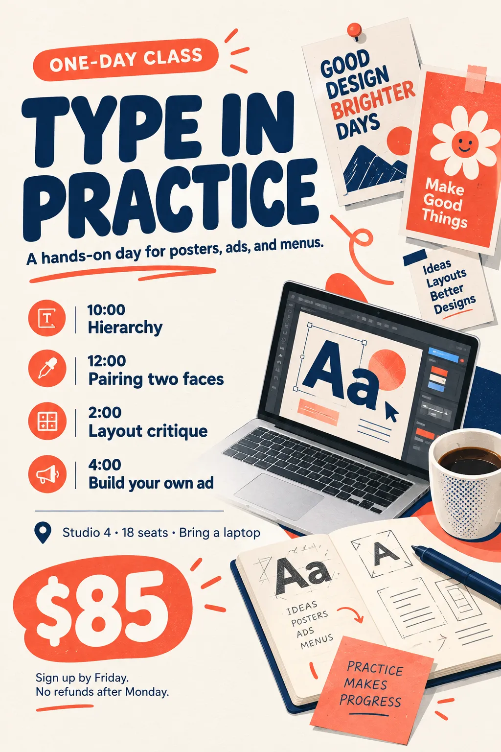
A one-day class poster carries a title, a one-sentence description, four agenda lines, seat details, a price, and fine print. The tone should feel open, and the agenda should scan in order.
Why use it: One rounded sans builds the whole sheet, with hierarchy coming from weight and size rather than a second face that would soften the schedule.
Best for: Classes, kids' or casual workshops, and friendly sign-up sheets.
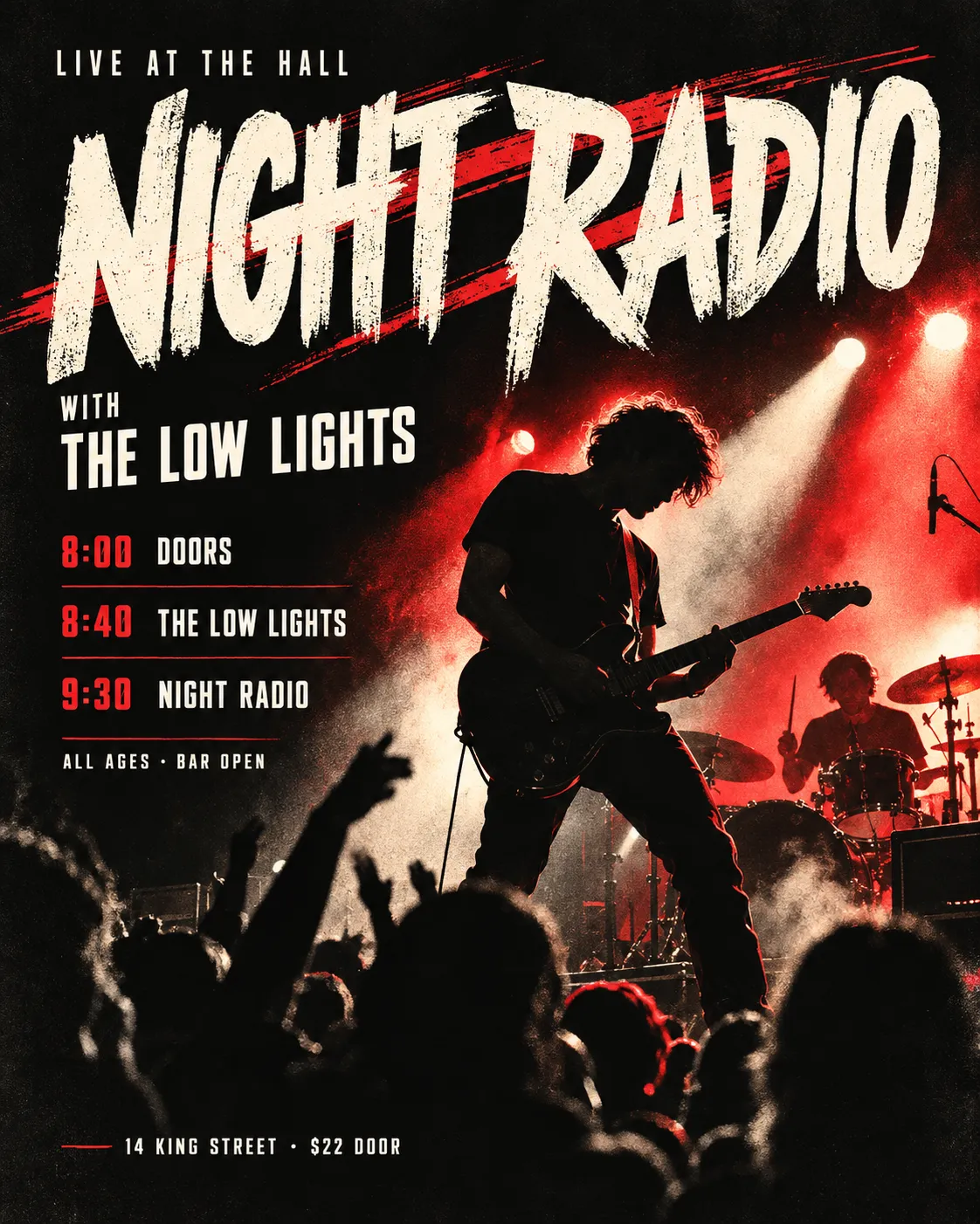
A gig poster stacks a venue kicker, the artist name, a support act, door and set times, an age note, and a ticket footer. The name has to hit first, then the times have to line up.
Why use it: Bold display is only the artist, and condensed sans runs every practical line so set times stay in one column and do not compete with the name.
Best for: Gigs, club nights, and sports fixtures with a stacked schedule.
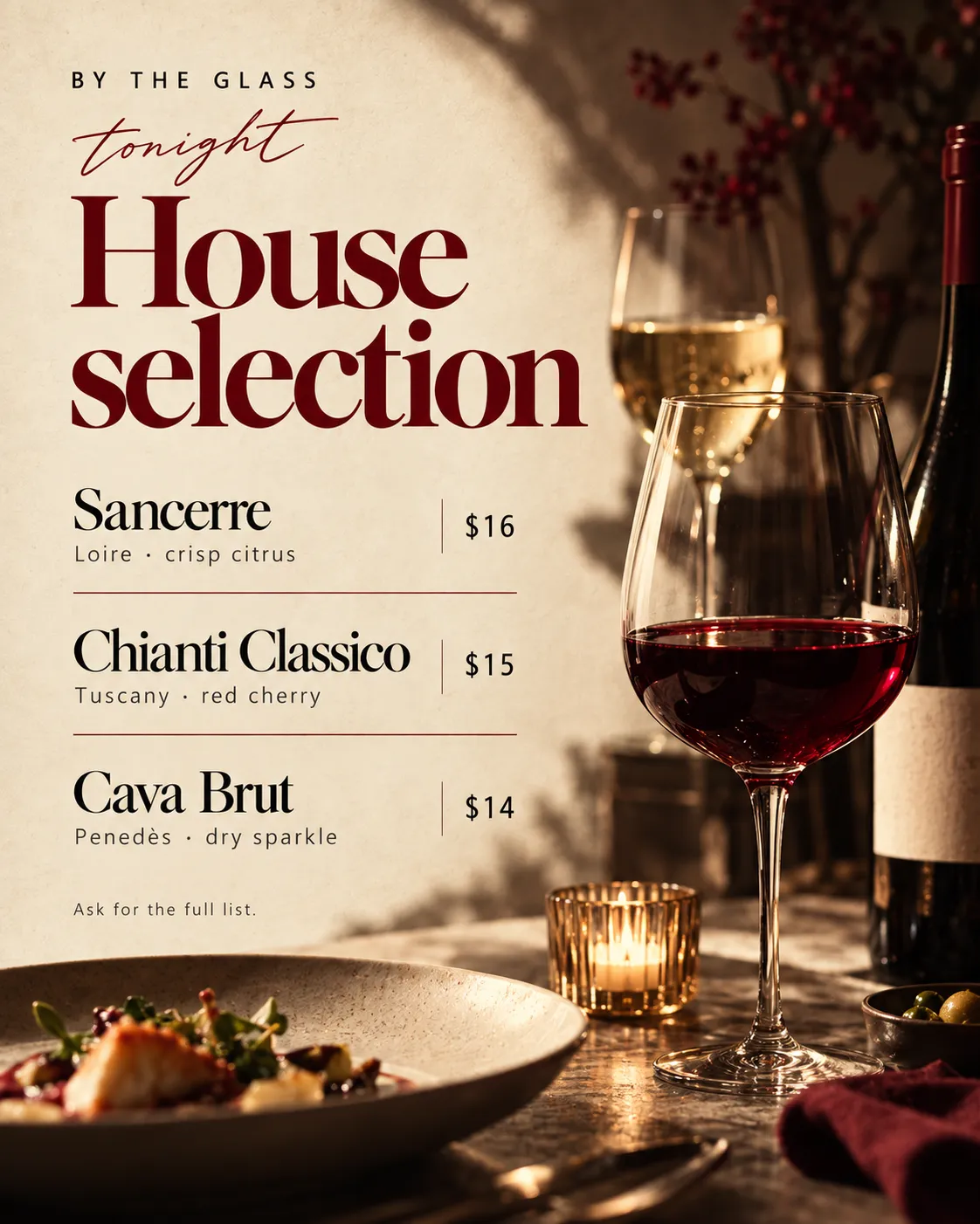
A by-the-glass card for one evening lists three wines, each with a region note and a price, plus a short footer. Names need a table voice, and prices need to stay plain.
Why use it: Old-style serif names the wines, light sans carries notes and prices, and script appears only on "tonight" so the list does not turn decorative.
Best for: Restaurant cards, tasting menus, and short wine or coffee lists.

A neighborhood hours notice lists the week, one closed day, two services, and a phone footer. Readers need the closed day and the number, not a campaign look.
Why use it: One humanist sans keeps the poster in the register of public information, so weight changes mark the closed day without introducing a brand face.
Best for: Clinics, libraries, offices, and any hours notice.
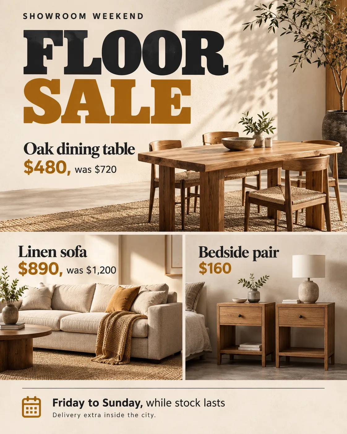
A showroom weekend poster names three products, each with a was/now price, then adds sale dates and a delivery line. Product names and numbers have different jobs.
Why use it: Slab serif names the goods with a solid retail weight, and modern sans holds prices and terms so the figures stay clear at small size.
Best for: Retail sales, showroom weekends, and product-plus-price posters.
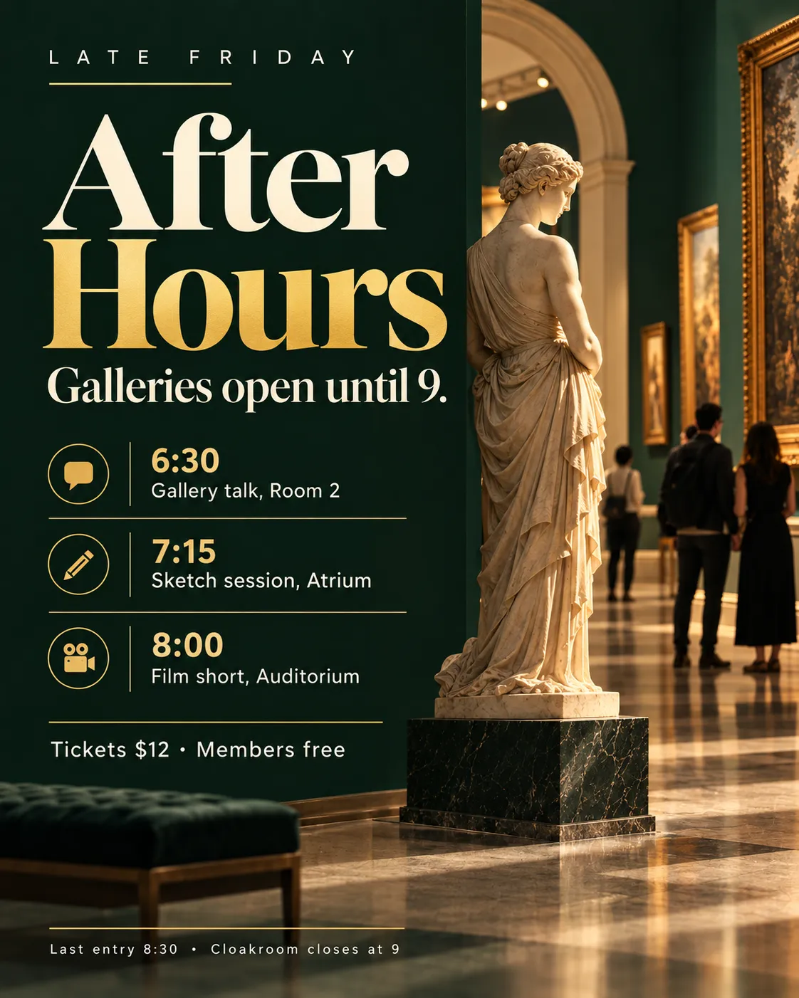
A late-opening poster has an exhibition title, one intro sentence, three timed programs, a ticket line, and a last-entry footer. The title can be editorial, and the program cannot.
Why use it: Elegant serif is the exhibition voice, and geometric sans takes the program and the logistics so room names and times do not inherit display styling.
Best for: Museums, talks, galleries, and cultural late nights.
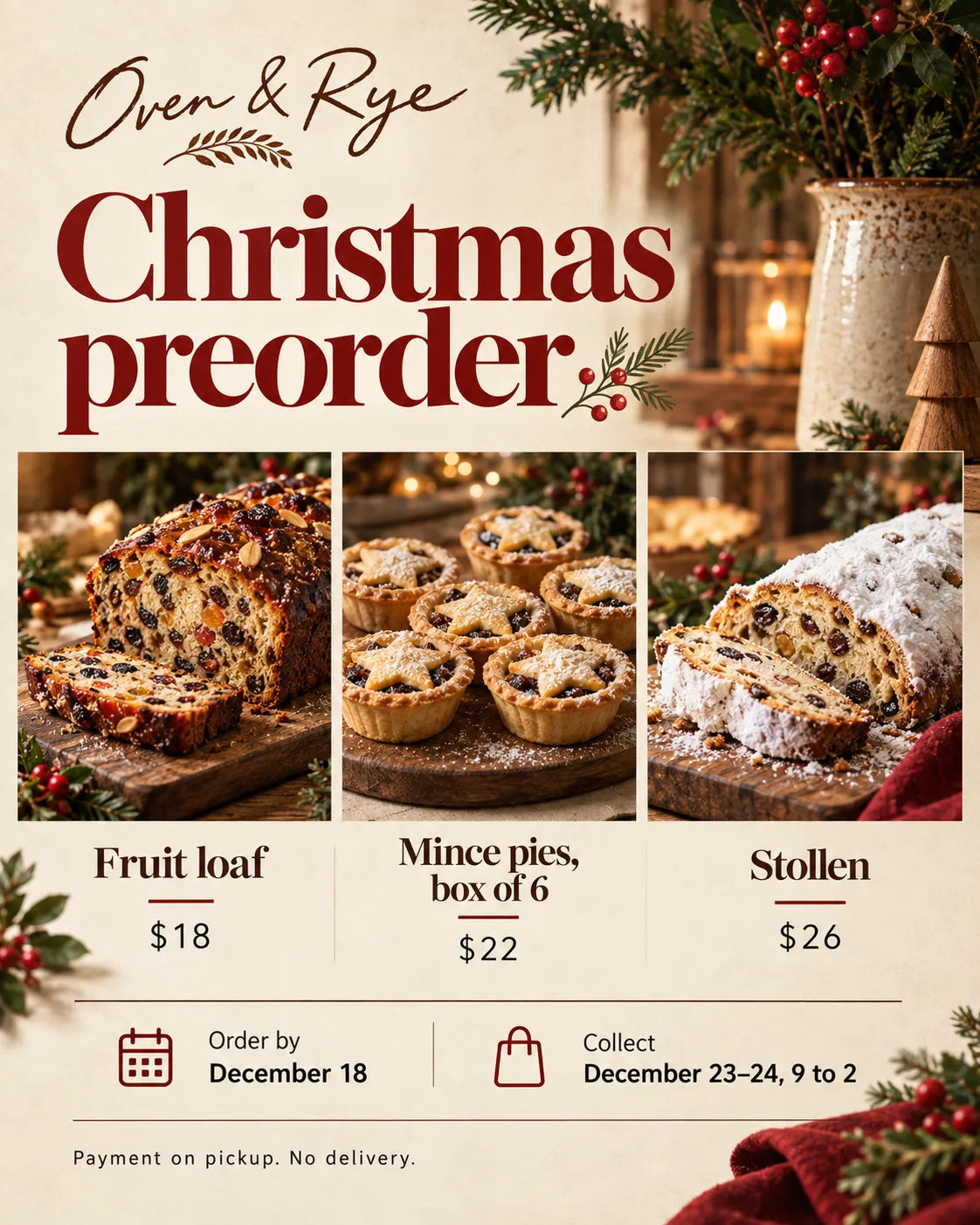
A holiday preorder sheet has a shop name, a seasonal headline, three items with prices, an order deadline, and pickup rules. Warmth belongs on the name, and the deadline has to be plain.
Why use it: Handwritten is the shop title only, serif names the goods, and light sans holds money and deadlines so the cutoff date is not written in a script.
Best for: Bakeries, holiday preorders, and small-shop price sheets.
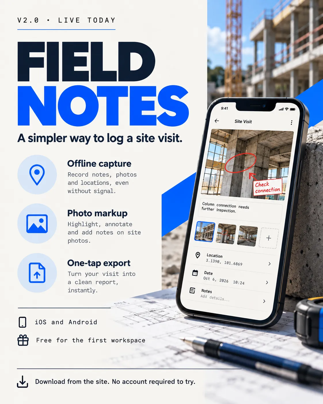
A launch poster has a version kicker, a product name, a one-line pitch, three features, platform and price details, and a download footer. The product can be commercial, and the version line should look technical.
Why use it: Geometric sans is the product voice, and monospace is limited to version, platform, and offer details so the feature list stays in the brand face.
Best for: Software launches, tools, and tech posters that still need a feature list.
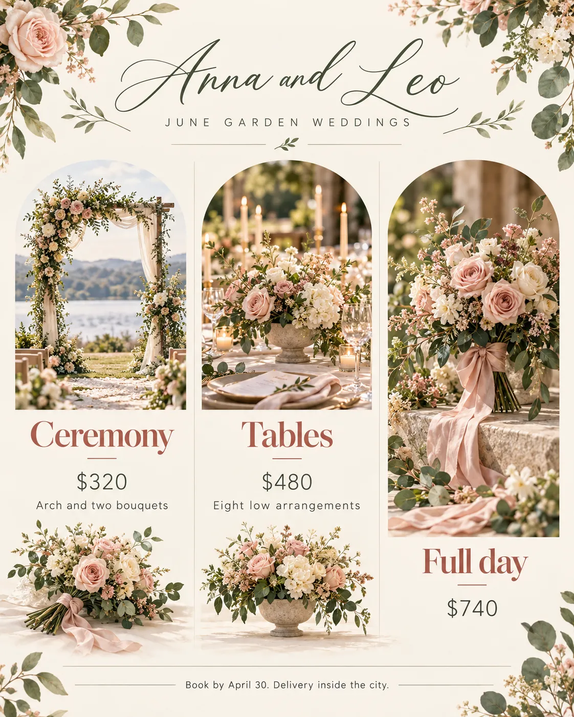
A wedding-flower sheet has the couple's names, a season line, three packages with prices, what each package includes, and a booking cutoff. The names can carry ornament. The packages, the prices, and the cutoff cannot.
Why use it: Formal script is only the couple's names, Didone serif names the packages, and light sans holds prices, inclusions, and the cutoff date.
Best for: Florists, stationers, and wedding package sheets.
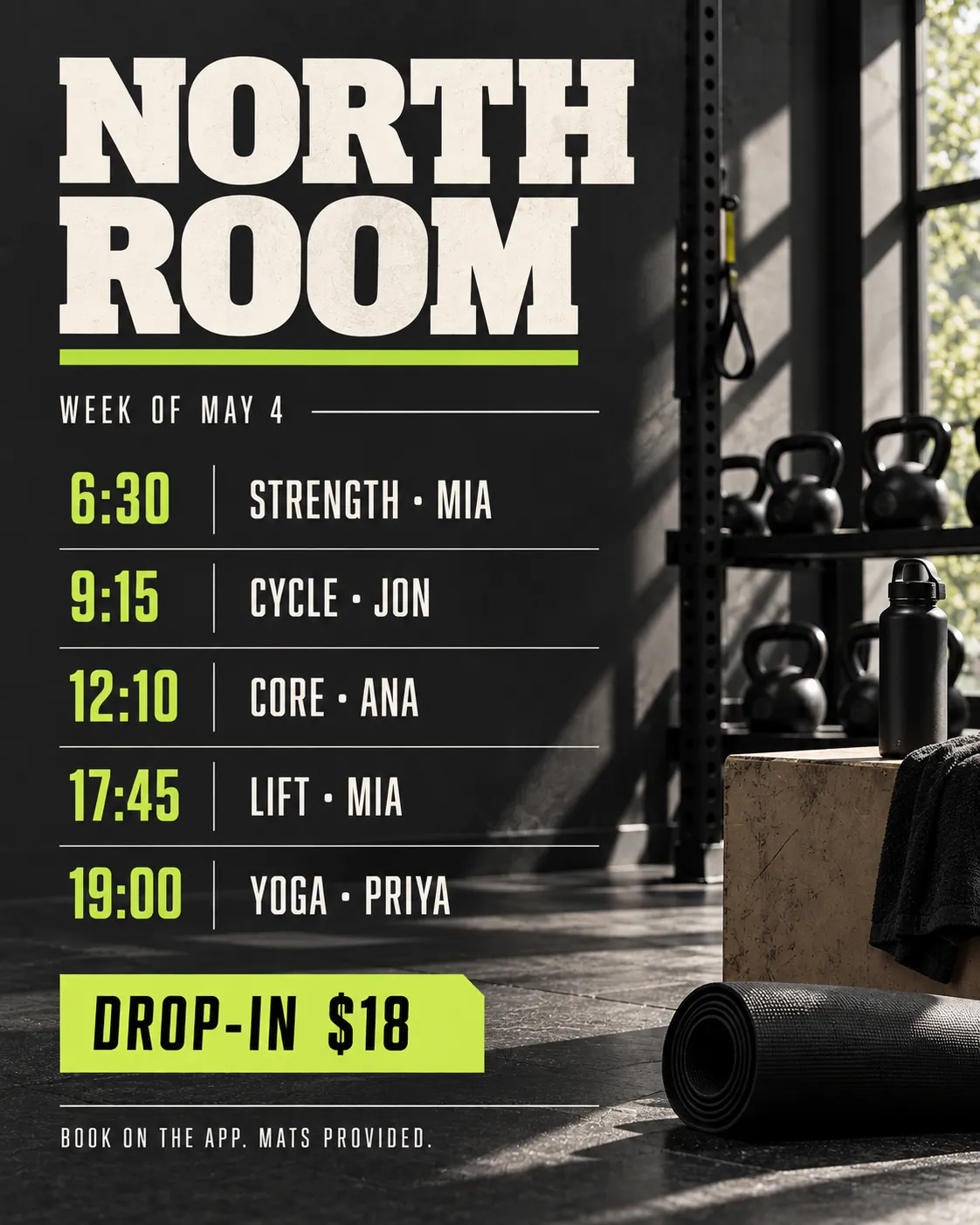
A weekly class board shows the gym name, a week label, five class rows with time and coach, a drop-in price, and a booking note. The grid is the poster, and each row has to fit on one line.
Why use it: Condensed sans runs the class rows so time, name, and coach stay together, while slab serif is reserved for the gym name.
Best for: Gym boards, studio weeks, and any repeating class timetable.
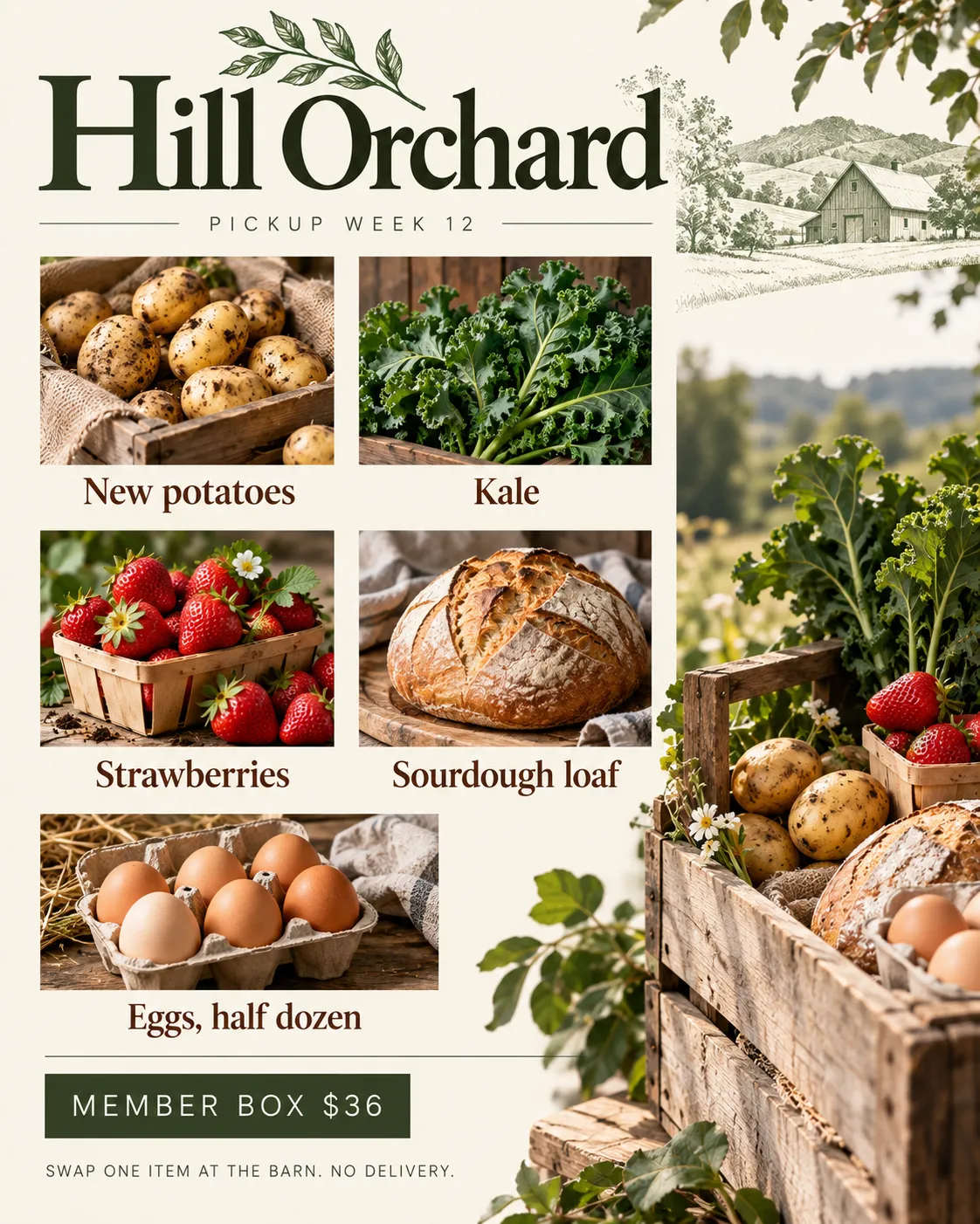
A weekly box poster has the farm name, the pickup week, five items in the share, a member price, and a swap note. The produce list is the point, and the price has to sit apart from the item names.
Why use it: Old-style serif names the farm and the items, and light sans holds the week, the price, and the swap rule so numbers do not inherit the editorial face.
Best for: Farm shares, grocery specials, and short produce lists.
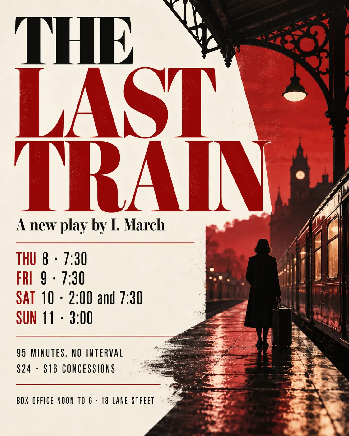
A play poster has the title, a one-line credit, four performance dates, a runtime, ticket prices, and a box-office footer. The title can be theatrical. The date stack has to stay plain enough to compare at a glance.
Why use it: Didone serif is the title and the credit, condensed sans runs the dates and prices, and the box-office line stays in that same sans.
Best for: Plays, film weeks, and any short run with a date stack.