Generating Usable, Vector-Ready Logo Marks with AI
Prompt constraints for flat, single-color AI logo marks that vectorize cleanly and still read at favicon size.
Prompt constraints for flat, single-color AI logo marks that vectorize cleanly and still read at favicon size.
Founders love the idea of typing a sentence and getting a logo back. The reality is messier. Most AI image generators are trained to produce polished, photorealistic, gradient-heavy illustrations, which is exactly the opposite of what a usable logo mark needs to be.
This gap between cool AI image and usable logo asset is a prompting problem, not a tooling problem. With the right constraints, you can steer image models toward flat shapes, limited color, and zero embedded text, which are the three things that make a mark easy to vectorize and legible at tiny sizes.
Understanding why those constraints matter, how to write prompts that consistently produce them, and how to judge whether what comes back is actually usable.
When you ask an AI image tool for "a logo for a beverage brand", you typically get a raster image full of soft shading, subtle gradients, and painterly texture. It looks great as a piece of art. It looks terrible the moment you try to:
Vectorization software works by detecting distinct edges and regions of flat color. Gradients, soft shadows, and photographic textures confuse that process, so the vectorizer either creates thousands of tiny unusable paths or flattens the image into a blob that loses the original shape entirely.
A logo mark is fundamentally a piece of information design, not illustration. Its job is to be recognized instantly at any size, not to impress someone staring at a full-resolution render for ten seconds.
The three failure points show up in almost every AI logo attempt:
Every successful AI logo prompt boils down to controlling the same three variables. Get these right and the rest of the prompt (subject matter, style references, mood) becomes far less risky to experiment with.
Explicitly instruct the model to avoid gradients, drop shadows, bevels, and 3D rendering. Ask for "flat vector illustration style" or "flat 2D icon design" rather than "logo design", which the model will often interpret as a polished mockup complete with lighting effects.
A one-color mark is the gold standard for versatility. It works in white on a dark app icon, black on a printed invoice, and any brand color you choose later, because the shape itself carries the meaning, not the coloring. If you need more than one color, cap it at two and ask for solid, non-gradient fills for each.
Never ask the model to render your brand name inside the image. Text generation in image models is unreliable at best, and even a perfect render locks your wordmark into a raster file you cannot edit. Design the symbol only, then pair it with a real typeface in a separate step using design software.
Treat the AI output as a concept sketch for your vector artist (or yourself in Illustrator), not as the final deliverable. The goal is a clean silhouette you can trace in minutes, not a finished asset straight out of the generator.
The table below shows how small changes in prompt wording lead to very different practical outcomes.
| Prompt Approach | Typical Output | Vectorizes Cleanly? | Readable at Favicon Size? |
|---|---|---|---|
| "Modern logo for a fintech app" | Glossy 3D badge with gradients and shadows | No | No |
| "Minimalist logo, flat design" | Flat shapes but often multi-color and cluttered | Sometimes | Sometimes |
| "Flat, single-color icon, no text, simple geometric shape, high contrast silhouette, vector style" | Clean bounded shape, one fill color, no text | Yes | Yes |
| "Logo with company name in bold letters" | Garbled or unreadable text baked into the image | No | No |
| "Icon on transparent background, flat vector, negative space technique" | Sharp silhouette with intentional negative space | Yes | Yes |
The pattern is consistent: the more specific you are about rendering constraints (flat, single-color, no text, silhouette, transparent background), the closer the output lands to something usable.
A reliable logo prompt has five layers. Stack them in this order and each one narrows the output toward something usable.
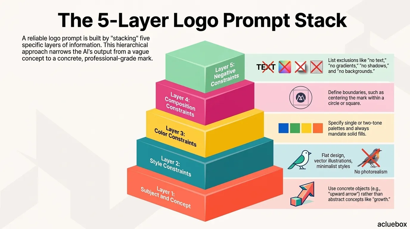
Layer 1: Subject and concept. What does the mark represent? A literal object, an abstract symbol, an initial, or a combination mark. Keep this short and concrete rather than abstract ("growth" is vague, "an upward arrow merged with a leaf" is concrete).
Layer 2: Style constraint. Flat design, vector illustration, geometric, minimalist. This is where you rule out photorealism and 3D rendering.
Layer 3: Color constraint. Single color, two-tone, or a named color if you already have a brand palette. Always specify solid fills.
Layer 4: Composition constraint. Centered, bounded within a circle or square, generous negative space, high contrast against the background.
Layer 5: Negative constraints. No text, no gradients, no shadows, no photorealism, no backgrounds or scenery.
Negative constraints matter as much as positive ones. Image models default to their training bias (detail, realism, depth) unless you explicitly rule those things out, so don't skip Layer 5 even if it feels repetitive.
Use this template as a starting point, then adjust the subject and style descriptors to match your brand concept.
A flat 2D logo mark of {{subject_description}}, minimalist geometric icon style, single solid color ({{primary_color}}) on a transparent or white background, bold simple shapes with clean edges, high contrast silhouette, centered composition with generous negative space, vector illustration style, no gradients, no drop shadows, no 3D rendering, no photorealism, no text, no letters, no words, no background scenery, symmetrical and easy to recognize at very small sizes
Here is the template applied to a hypothetical outdoor gear brand called Ridgeline.
A flat 2D logo mark of a mountain peak merged with an upward arrow, minimalist geometric icon style, single solid color (forest green) on a transparent or white background, bold simple shapes with clean edges, high contrast silhouette, centered composition with generous negative space, vector illustration style, no gradients, no drop shadows, no 3D rendering, no photorealism, no text, no letters, no words, no background scenery, symmetrical and easy to recognize at very small sizes
Running variations of this prompt with different subjects (a compass needle, a folded tent silhouette, initials abstracted into a geometric mark) tends to produce consistent, flat, single-color shapes that are genuinely fast to clean up in vector software.
Even a well-prompted image is still a raster file (PNG or JPG) when it comes out of the generator. Getting to a production-ready logo takes a few more steps.
If a shape is not recognizable when you shrink it down and squint, it will not work as a favicon or app icon no matter how good it looks full size. Simplify further rather than trying to preserve detail that only reads at large sizes.
Even with a solid prompt template, a few habits reliably derail the process.
Asking for too much symbolism in one mark. A logo that tries to represent five different brand values at once ends up visually cluttered. Pick one clear concept and let the rest of your brand story live in your marketing copy, not the icon itself.
Skipping the transparent background instruction. Without it, models often place the shape inside a colored card, badge, or scene, which adds extra elements you then have to manually remove before vectorizing.
Trusting the first result. Image generation is stochastic. The same prompt run five times will give you a spread of quality, and the best practice is to generate a batch and select, not to accept the first output as final.
Forgetting real-world test contexts. A shape can look balanced on a plain canvas and still feel off-center once it's placed inside a circular app icon mask or a square social avatar frame. Always mock it up in those real contexts before finalizing.
Trying to get the wordmark and symbol in one generation. Keep the symbol and the typography as separate design decisions. Generate the mark with AI, then pair it with a chosen typeface in your design tool of choice.
Once you have a working template, you can experiment with style language (line-art, negative space, mascot-inspired, brutalist geometric) without sacrificing usability, as long as you keep the three core constraints locked in place: flat, single-color, no text.
Swap out phrases like "geometric icon style" for "line-art icon style" or "negative space technique" and you will get meaningfully different aesthetics while keeping the output vectorizable.
A useful habit is to keep a running document of prompt variants that worked well for your brand, along with the seed shapes they produced. Over a handful of sessions, you'll build an intuition for which descriptive words push the model toward flat geometry (bold, simple, iconic, minimal) and which words push it toward the opposite (detailed, realistic, ornate, dimensional).
A usable AI-generated logo mark isn't about finding the perfect one-shot prompt. It's about consistently applying three constraints (flat design, single-color geometry, and zero embedded text) so that whatever concept you're testing comes back in a form your vector software can actually work with. Treat the AI as a fast way to explore dozens of shape concepts, then bring the strongest one into a proper vector editor for the final polish. That combination gets you from idea to a genuinely usable, scalable logo mark far faster than either approach on its own.
No. AI image generators output raster files (PNG, JPG), not vector files. Even a perfectly prompted result needs to be run through a vectorizer and cleaned up in a vector editor before it's truly production-ready for print, embroidery, or scalable digital use.
Most image models are trained on a huge volume of polished, dimensional artwork, so gradients and shading are their default bias. Explicitly listing negative constraints like "no gradients, no shadows, no 3D rendering" in the same prompt as your positive style instructions helps counteract that bias, though it may take a few regenerations to get a clean result.
Generally no. Text rendering in image models is unreliable and often produces garbled or misspelled letters. It's better to generate the symbol alone and pair it with your chosen typeface separately in a design tool, which also gives you full control over kerning, sizing, and language localization later.
Aim for at least five to ten generations per prompt concept before evaluating. Image generation has enough randomness that a single result isn't representative of what the prompt can produce, and batching gives you real options to compare side by side.
Export or screenshot the shape, resize it down to 16x16 or 32x32 pixels in an image editor, and look at it at actual size on a screen rather than zoomed in. If the shape blurs into an unrecognizable blob at that size, simplify the design further before finalizing it.