10 Best AI Hand-Drawn Art Styles for Content Creators (2026)
A ranked breakdown of 10 AI hand-drawn art styles, what each one is best for, and how to pick the right fit for your content.
A ranked breakdown of 10 AI hand-drawn art styles, what each one is best for, and how to pick the right fit for your content.
Hand-drawn visuals have quietly taken over feeds, slide decks, and newsletters. There is something about a wobbly line or a loose sketch that feels more human than a polished 3D render, and audiences notice the difference.
AI tools have made this look accessible to anyone, not just illustrators with years of practice. A few prompts now produce doodles, ink washes, or comic panels that used to take hours to draw by hand.
The challenge is picking the right style for the right job. So, below are 10 AI hand-drawn art styles worth knowing in 2026, what each one does well, and how to match them to your content.
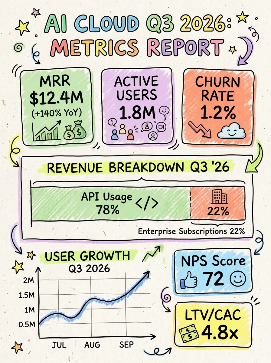
Best for: SaaS product updates, metric teardowns, and analytics explainers.
Hand-drawn dashboards reimagine rigid UI layouts, charts, and KPI cards with sketchy borders, handwritten figures, and playful doodle accents. Instead of intimidating viewers with cold, dense grids and sterile spreadsheet aesthetics, this style turns complex metrics and software interfaces into an inviting, bite-sized visual story.
It is exceptionally effective for product marketing, newsletter breakdowns, and social media announcements where you want to highlight traction, feature overhauls, or workflow milestones. The hand-crafted aesthetic cuts through corporate noise and makes performance data feel human, tangible, and fun to explore.
Key strength: transforms complex data and software UI into charming, easily digestible visuals.
Best for: brand illustrations, product mockups, and website hero sections.
A single continuous line, minimal shading, and lots of white space define this style. It suits brands that want to look refined without feeling cold, and it scales beautifully across formats from favicons to full-page banners.
Because there is so little visual noise, minimalist line art rarely clashes with existing brand colors or typography. Designers often reach for it when a page already has strong photography and just needs a quiet accent.
Key strength: stays elegant and versatile without competing with other design elements.
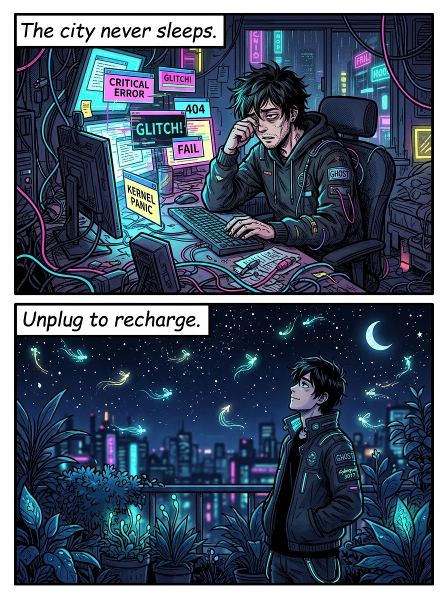
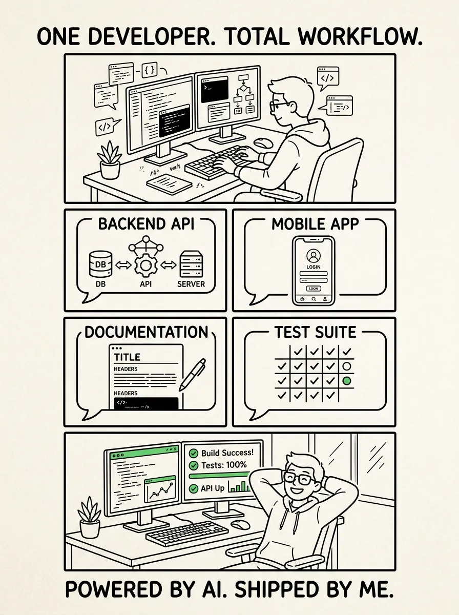
Best for: storytelling posts, customer journey maps, and tutorial threads.
Panels, speech bubbles, and expressive characters give this style built-in pacing. Readers instinctively know to move from box to box, which makes it a natural fit for sequences like onboarding flows or before-and-after case studies.
It also injects personality into topics that could otherwise feel flat, like software walkthroughs or support FAQs. A character reacting with surprise or relief does more emotional work than a paragraph of text ever could.
Key strength: guides the reader through a sequence while adding personality.
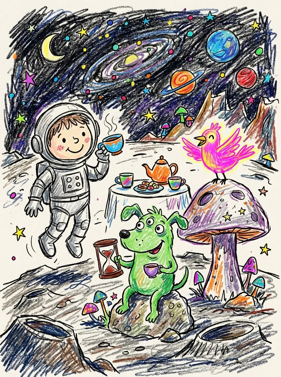
Best for: brainstorming visuals, meme-style posts, and quick reaction content.
Rough scribble embraces imperfection on purpose. Lines overlap, shading is uneven, and nothing looks too planned, which is exactly the point when you want content to feel spontaneous rather than produced.
This style shines on short-form video thumbnails and social posts meant to stop a scroll. It reads as candid and unfiltered, which builds trust with audiences who are tired of overly polished marketing visuals.
Key strength: feels spontaneous and authentic, ideal for fast, casual content.
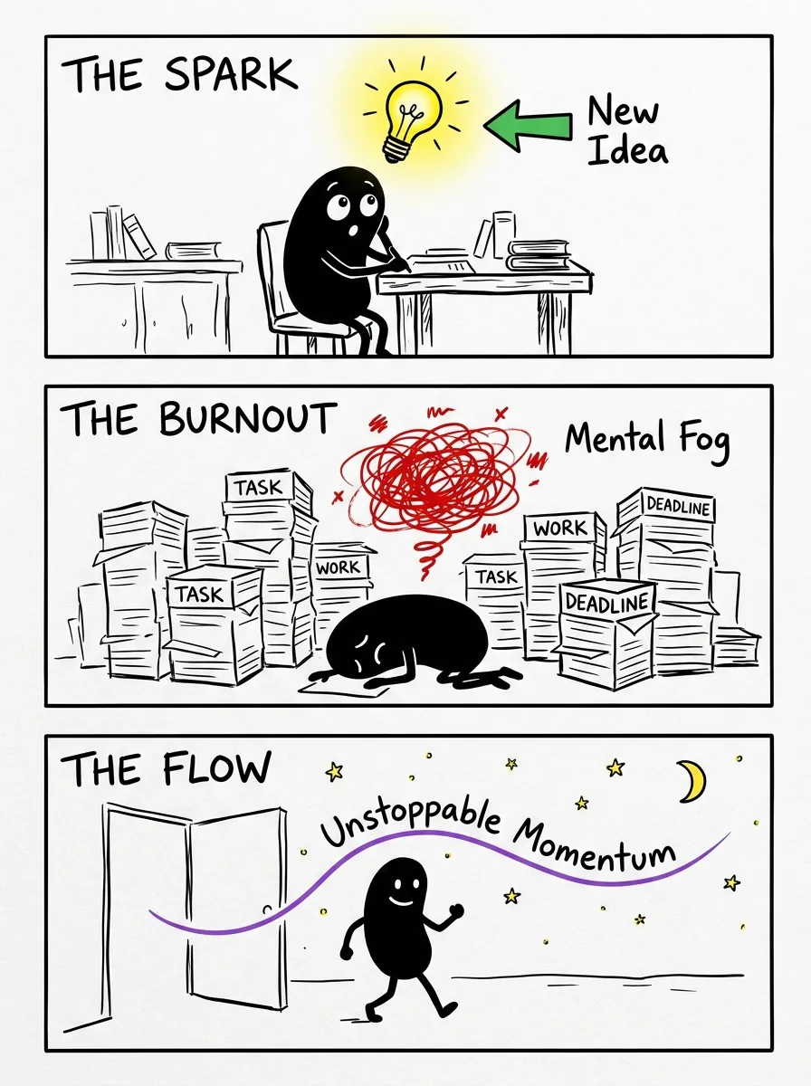
Best for: mascots, avatar sets, and lighthearted brand characters.
Rounded bean-shaped bodies with simple limbs and expressive faces have become a favorite for brands that want a recognizable, huggable mascot. The shapes are simple enough to animate cheaply but distinctive enough to stick in memory.
Creators use bean figures for recurring social media characters, app onboarding guides, and merch designs. Their charm comes from being instantly likable without needing a detailed backstory.
Key strength: builds a memorable, friendly identity that audiences recognize instantly.
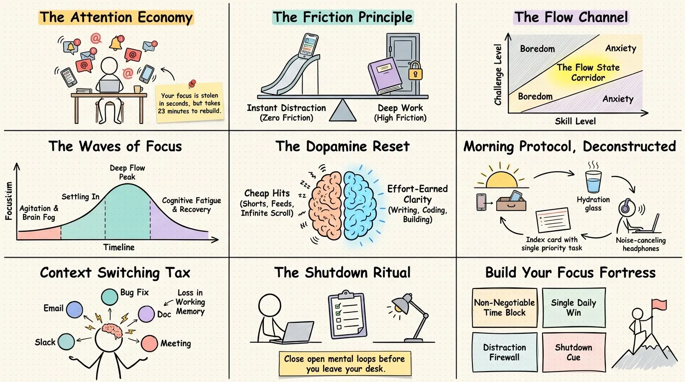
Best for: SaaS explainers, workflow diagrams, and technical walkthroughs.
This style mimics the loose, sketchy shapes of a virtual whiteboard tool, complete with slightly wobbly rectangles and hand-lettered labels. It signals working documentation rather than a finished pitch, which makes technical audiences trust it more.
Product teams use it for architecture diagrams, roadmap visuals, and feature explainers where clarity matters more than polish. The rough edges actually help readers focus on the logic instead of the design.
Key strength: communicates technical ideas clearly without feeling overly formal.
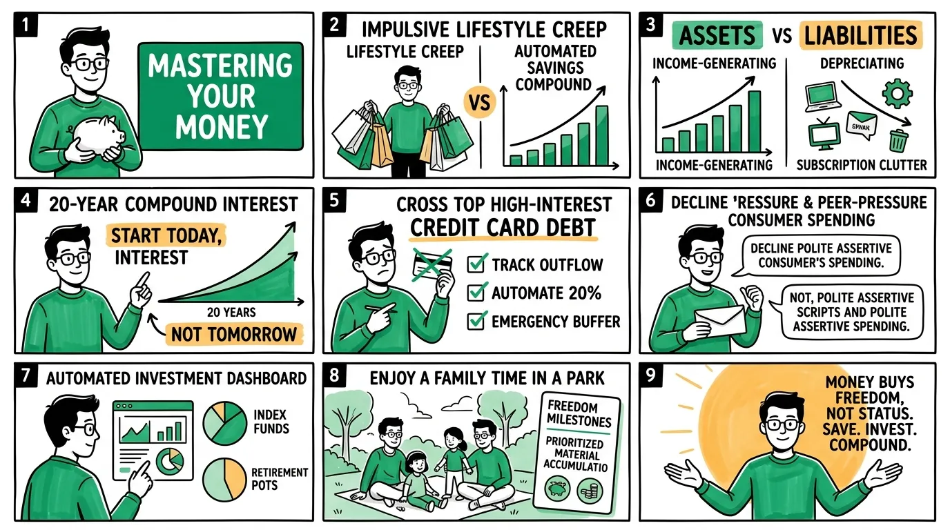
Best for: lifestyle content, event promotion, and colorful social campaigns.
Bold color blocking, playful patterns, and energetic linework define this style. It borrows from editorial illustration and streetwear graphics, giving content a bright, modern feel that photographs and screenshots alone cannot match.
Creators lean on vibrant studio doodles for launch announcements, seasonal campaigns, and anything that needs to feel like an event rather than routine content. The energy carries well across Stories and Reels covers too.
Key strength: adds bold color and energy that grabs attention instantly.
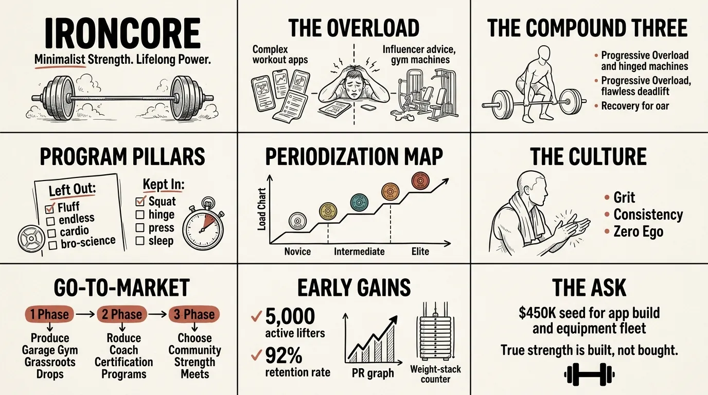
Best for: startup decks, investor updates, and internal presentations.
Sketch-style icons and hand-lettered headers replace stiff stock graphics on slides, making dense business content feel more human. This is especially useful for early-stage teams that want to show personality before they have a full brand system.
Doodle decks also help simplify complicated ideas, since a rough icon of a growth arrow or a lightbulb communicates faster than a paragraph of jargon. Investors and teammates tend to remember sketched slides longer than generic templates.
Key strength: simplifies complex business ideas while adding a memorable, personal touch.
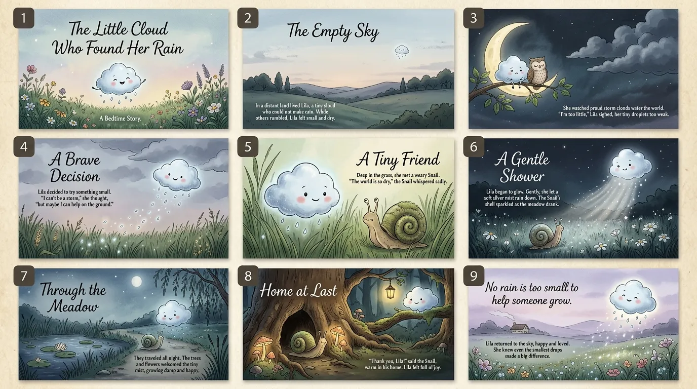
Best for: children's content, brand fairy tales, and emotional campaign visuals.
Soft colors, exaggerated proportions, and dreamy backgrounds give this style a fairy tale quality. It works well for anything meant to feel warm, nostalgic, or imaginative, from kids products to holiday campaigns.
Because it leans so heavily on emotion, whimsical storybook art is best saved for moments that need a heartfelt touch rather than everyday posting. Used sparingly, it can make a campaign feel genuinely special.
Key strength: creates an emotional, imaginative connection that generic visuals rarely achieve.
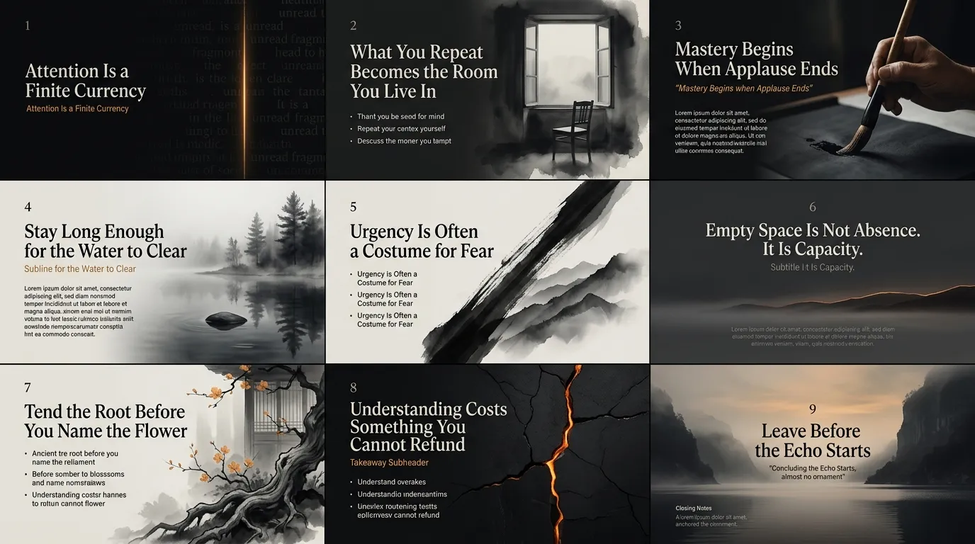
Best for: luxury branding, philosophical essays, wellness platforms, and editorial features.
Rooted in traditional East Asian brush painting, Sumi-e combines fluid black ink strokes, tonal gradients, and generous negative space to capture the spirit of a subject with minimal detail. The interplay between wet ink bleeds and dry brush textures gives generated images an organic, zen-like presence that feels deliberate and mastercrafted.
Editorial writers, wellness brands, and premium publications use Sumi-e to establish depth and contemplative poise. Because it strips away unnecessary color and clutter, it cuts through digital overstimulation and anchors serious, high-trust messaging.
Key strength: conveys timeless elegance and zen minimalism through expressive brushwork and negative space.
| Style | Best For | Mood | Ideal Platform |
|---|---|---|---|
| Hand-Drawn Dashboard | SaaS updates, metric teardowns | Engaging, intuitive | Newsletters, LinkedIn |
| Minimalist Line Art | Branding, product mockups | Elegant, quiet | Website, portfolio |
| Comic Layout | Storytelling, tutorials | Playful, sequential | Twitter/X threads, blog |
| Rough Scribble | Reaction content, memes | Spontaneous, raw | TikTok, Reels thumbnails |
| Bean Figure Doodle | Mascots, avatars | Friendly, cute | Social media, merch |
| Excalidraw-Style Whiteboard | SaaS explainers, diagrams | Technical, clear | Docs, product pages |
| Vibrant Studio Doodle | Event promo, lifestyle | Energetic, bold | Stories, campaign visuals |
| Doodle-Style Pitch Deck | Startup decks, updates | Human, simple | Slides, presentations |
| Whimsical Storybook | Kids content, emotional campaigns | Warm, nostalgic | Campaigns, packaging |
| Sumi-e Ink Wash Style | Luxury branding, editorial | Meditative, timeless | Newsletters, features |
Match the style to the mood you want your audience to feel first, then confirm it works on the platform where the content will actually live. A style that photographs beautifully on a website hero can fall flat as a tiny thumbnail, so always test at the final size before committing.
1. What makes AI hand-drawn art different from regular AI-generated images?
Hand-drawn styles are trained or prompted to mimic sketching, linework, and imperfect shading rather than photorealism or 3D rendering. This gives the output a warmer, more personal feel that suits content meant to build trust rather than impress with technical polish.
2. Can I use more than one hand-drawn style across my brand?
Yes, many creators mix styles depending on content type, such as Excalidraw-style diagrams for docs and bean figure doodles for social posts. The key is keeping a consistent color palette or character so the styles still feel connected to the same brand.
3. Which style works best for short-form video content?
Rough scribble and vibrant studio doodle tend to perform well on TikTok and Reels because they read clearly even at small sizes and grab attention within the first second. Styles with fine tonal gradients, like Sumi-e ink wash, often lose impact on a phone screen.
4. Do hand-drawn AI styles work for B2B or technical content?
Absolutely, the Excalidraw-style digital whiteboard and doodle-style pitch deck were built for exactly this. They simplify complex ideas without looking unprofessional, which is why so many SaaS teams use them for documentation and investor materials.
5. How do I choose between minimalist line art and Sumi-e ink wash for branding?
Choose minimalist line art if your brand needs to stay clean and versatile across many formats, and choose Sumi-e ink wash if you want a slower, more contemplative tone for premium or editorial content. Test both against your existing brand colors before deciding.